User Interface
Note
One of the goals of NetXMS Management Client is to provide identical user experience across all supported platforms, including Web Interface. Screenshots in this particular guide are based on Windows version.
Login
Login Dialog
When Management Client is started, user is presented with login dialog. User should enter server host name or IP address, login and password.
Perspectives
On the left hand side of Management Client there are perspective selection buttons. Each perspective serves its logical purpose, e.g. showing monitored objects, editing data collection templates, etc.
A perspective contains one or multiple views. If there are multiple views, they are organized as View Stack with tab navigation.
Some perspectives have a button in upper right corner which opens a view with additional object information.
Some views may have a toolbar above it on the right hand side - icons on the toolbar provide access to frequently needed actions. If available, a view’s menu is displayed under vertical ellipsis icon on the toolbar.
Available perspectives are:
Infrastructure (allows organizing objects in logical way, based on location, type of node etc)
Network (organizes objects by zone and network subnet)
Assets (hierarchical structure of available hardware assets)
Templates (special objects with data collection and policy configuration)
Dashboards (combines any available visualization components with data from multiple sources in order to create high-level views to see network (or parts of it) health at a glance.)
Graphs (saved graphs with can display collected data from multiple objects)
Maps (layer 2 topology, IP Topology or Custom maps)
Alarms (alarm view for all objects)
Business Services (tool for availability monitoring of logical services. Company email, web site, server farm, call center - all are examples of logical services.)
Reporting (handles execution and rendering of reports by communication to separate reporting process)
Logs (collective view of different logs)
Monitor (event, trap and log collective display in real time)
Tools (selection of powerful search and NetXMS server management tools)
Configuration (provides access to configuration of the system)
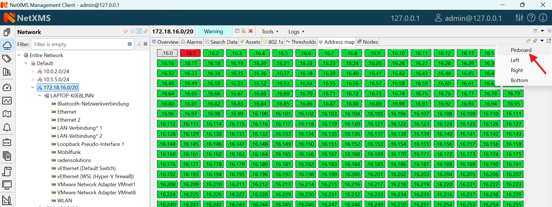
Pinboard (allows quick access to favorite views, for adding a view to pinboard see example below)
Object Browser
Some perspectives, e.g. Infrastructure, Network, Templates, etc… use object browser. Object browser represents objects as a tree. Tree is built based on object hierarchy and user permissions. Only objects available to currently logged in user will be shown. User has two options to interact with objects:
Click Left mouse button to select object. Views on the right hand side provide information about currently selected object (see Object details).
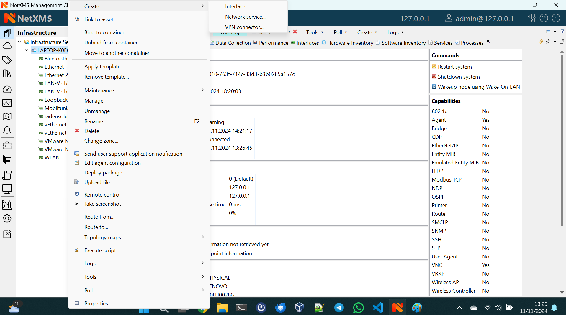
Click Right mouse button to open context menu with actions available for this particular object type
Object status
System track status of each object, which can range from Minor to Critical. Status is displayed as overlay on icon of each object.
Filtering
Above object tree there is filter field that allows to filter objects in the object tree. Filter supports a number of prefix characters that define how search is performed:
Prefix |
Status |
|---|---|
> |
Search by IP address part |
^ |
Search by exact IP address |
# |
Search by object ID |
/ |
Search by comment |
@ |
Search by zone ID |
Without prefix search is performed by object name.
As-you-type filter in action
Object details
This view provides one or more tabs with detailed information about object currently selected in Object Browser. List of available tabs depends on type of the selected object.
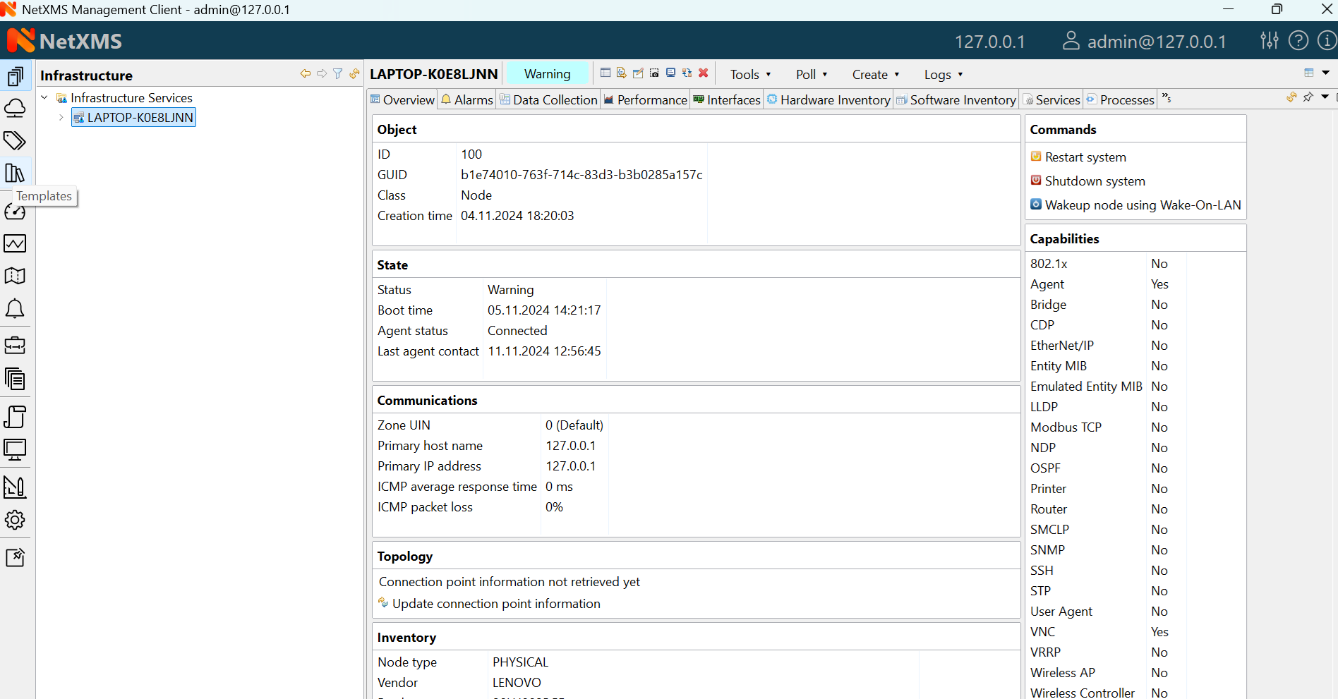
Overview
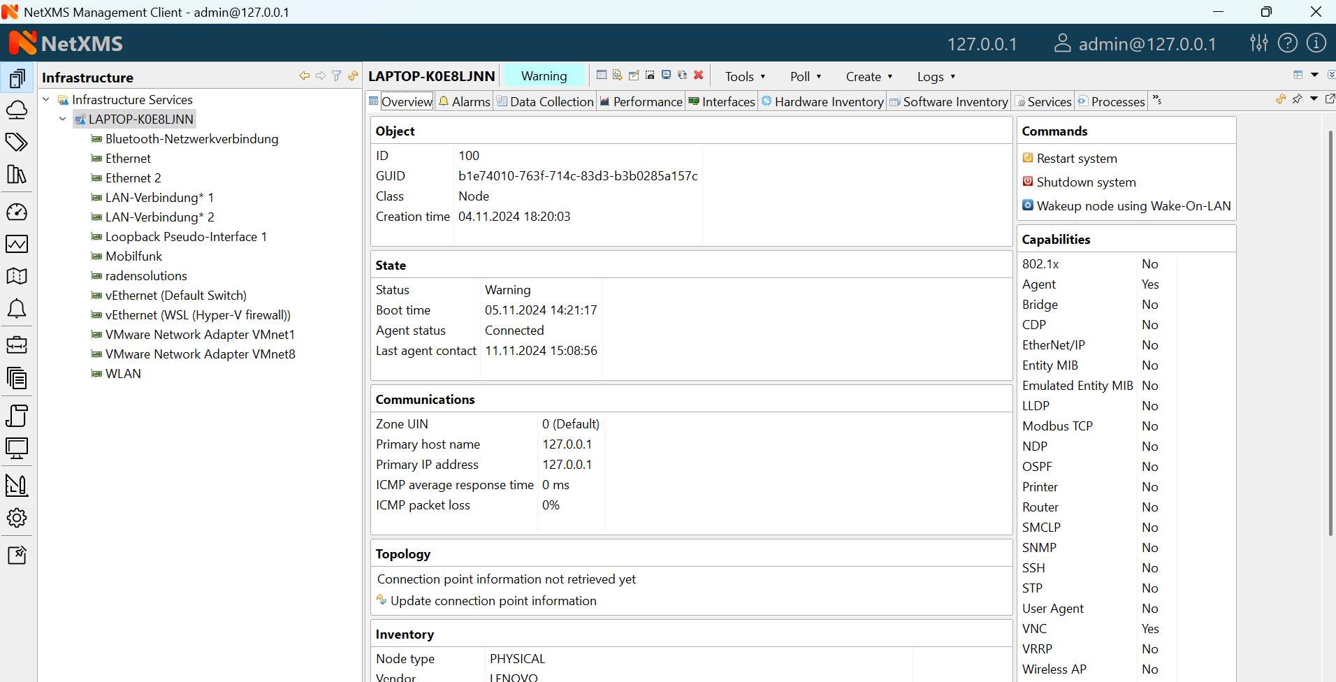
Overview tab
This view provides basic information about selected object: Name, Class, Status and comments. For Node objects, it also show IP address, Host name, SNMP details as well as Capabilities.
Node capabilities
Node capabilities displays results of capability auto-detection (it’s performed on Configuration Poll). E.g.:
Capability |
Description |
|---|---|
Agent |
True if NetXMS Server can communicate with NetXMS agent installed on the node |
Router |
True if selected object can route network traffic |
SNMP |
True if NetXMS Server can communicate with this device via SNMP protocol |
SSH |
True if NetXMS Server has credentials and is able to connect to this device via ssh |
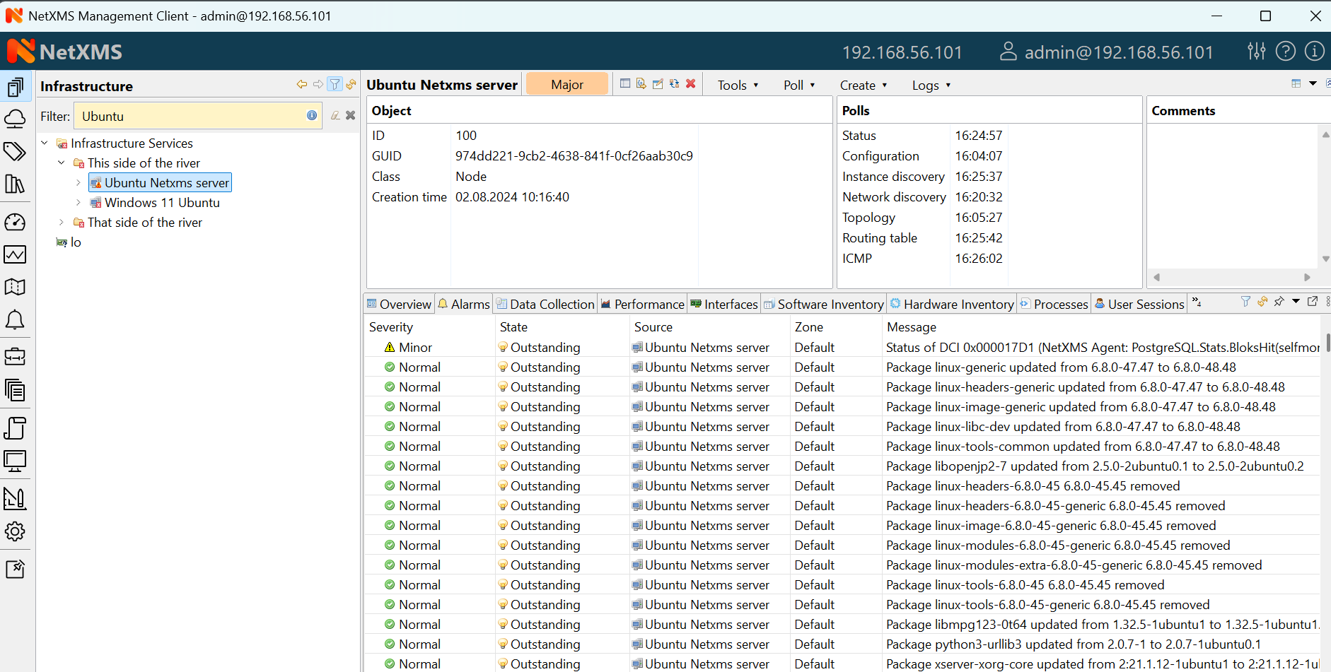
Alarms
Alarm view provides user with list of alarms for currently selected element of the tree, including all child objects. To view all alarms in the system, either use system-wide Alarm Browser (click to open) or select Entire Network object. Right-click on the alarm will open pop-up menu with available actions
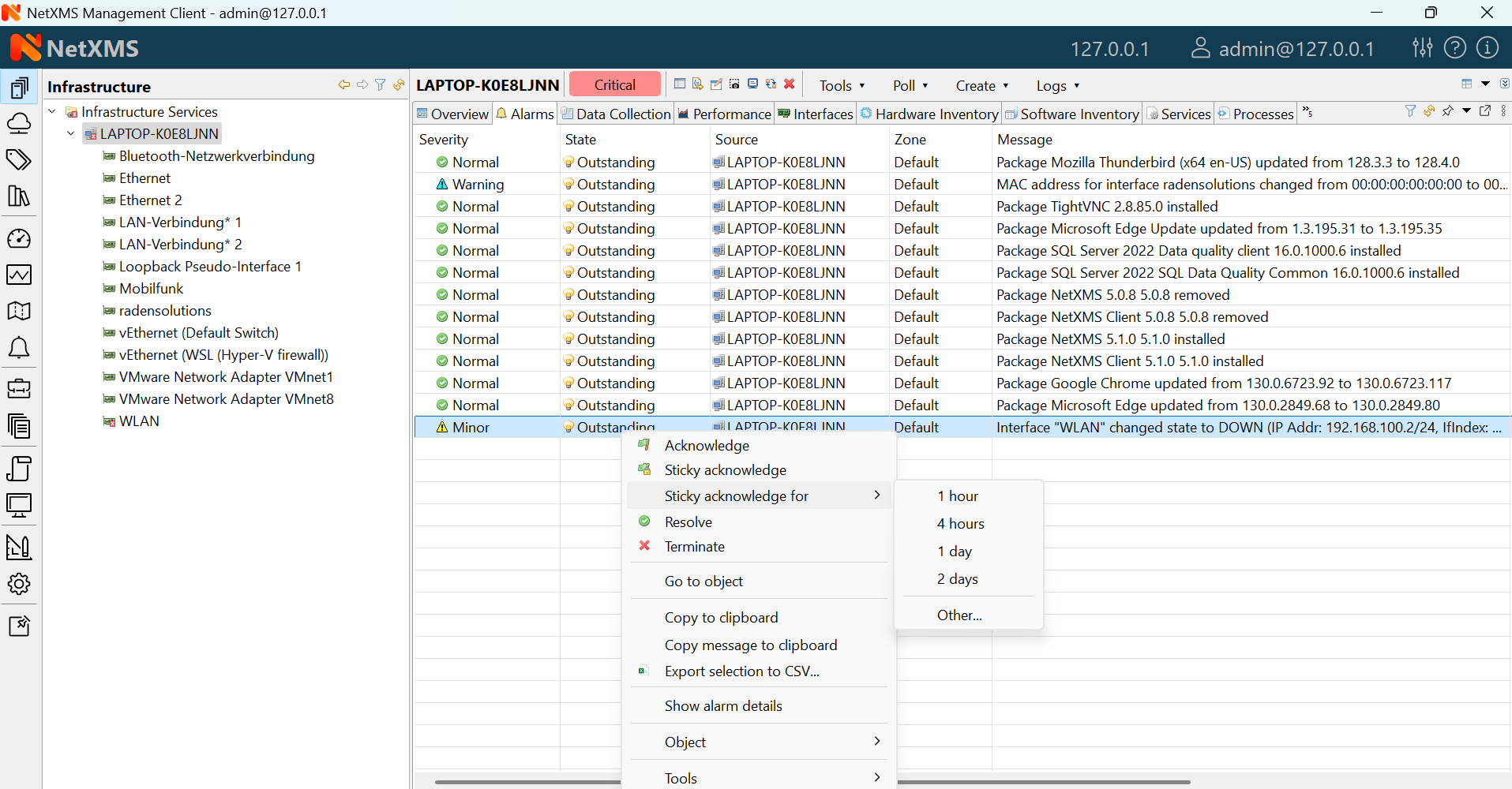
Alarm context menu
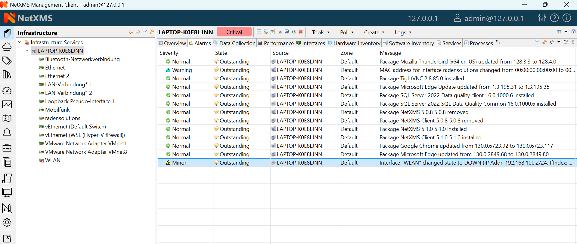
Each alarm can be in one of the following states:
State |
Description |
|---|---|
Outstanding |
Newly created alarm, no actions was taken by user |
Acknowledged |
User acknowledged raised issue, work in progress |
Resolved |
Issue resolved, but alarm is kept in the list. This state mostly used when alarm is automatically resolved by the system, to keep users informed about incident |
Terminated |
Issue resolved and alarm removed from list. |
Data collection
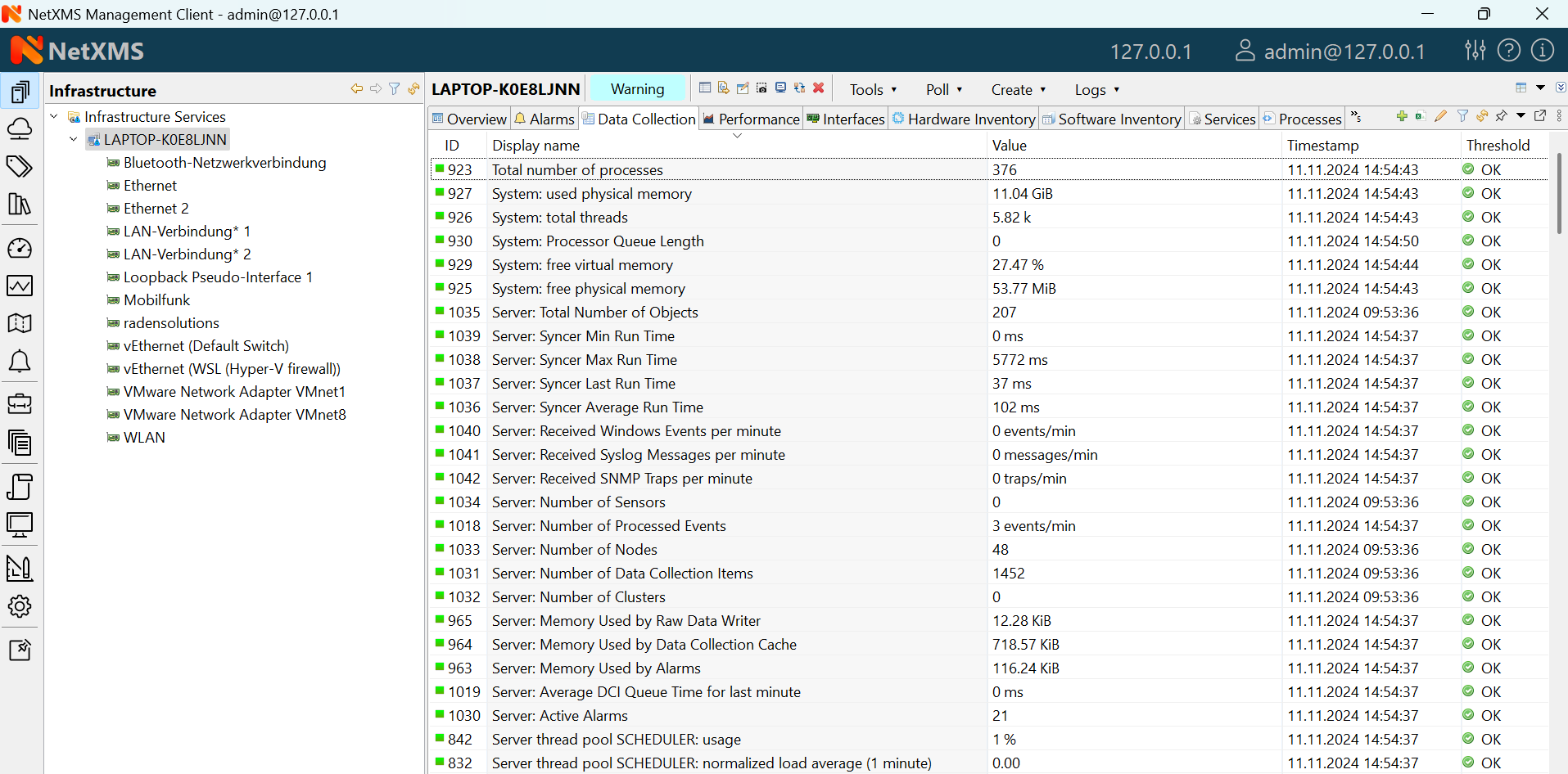
This view provides access to all collected data, both latest and historical. When view is shown, it displays latest values, as well as timestamp when each value was collected. Threshold column indicates threshold violations for given DCI. User has two options to interact with data:
Double click on a DCI will open line graph view for last hour
Right-click on a DCI will open pop-up menu giving access to available actions
History - show historical data
Line Chart, Pie Chart, Bar Chart - show historical data in graphical form
Clear collected data - remove all history for selected DCI
Clicking Edit mode button on the toolbar changes Data collection view into editing mode. In this mode information about DCI configuration is displayed, double click on a DCI will open it for editing.
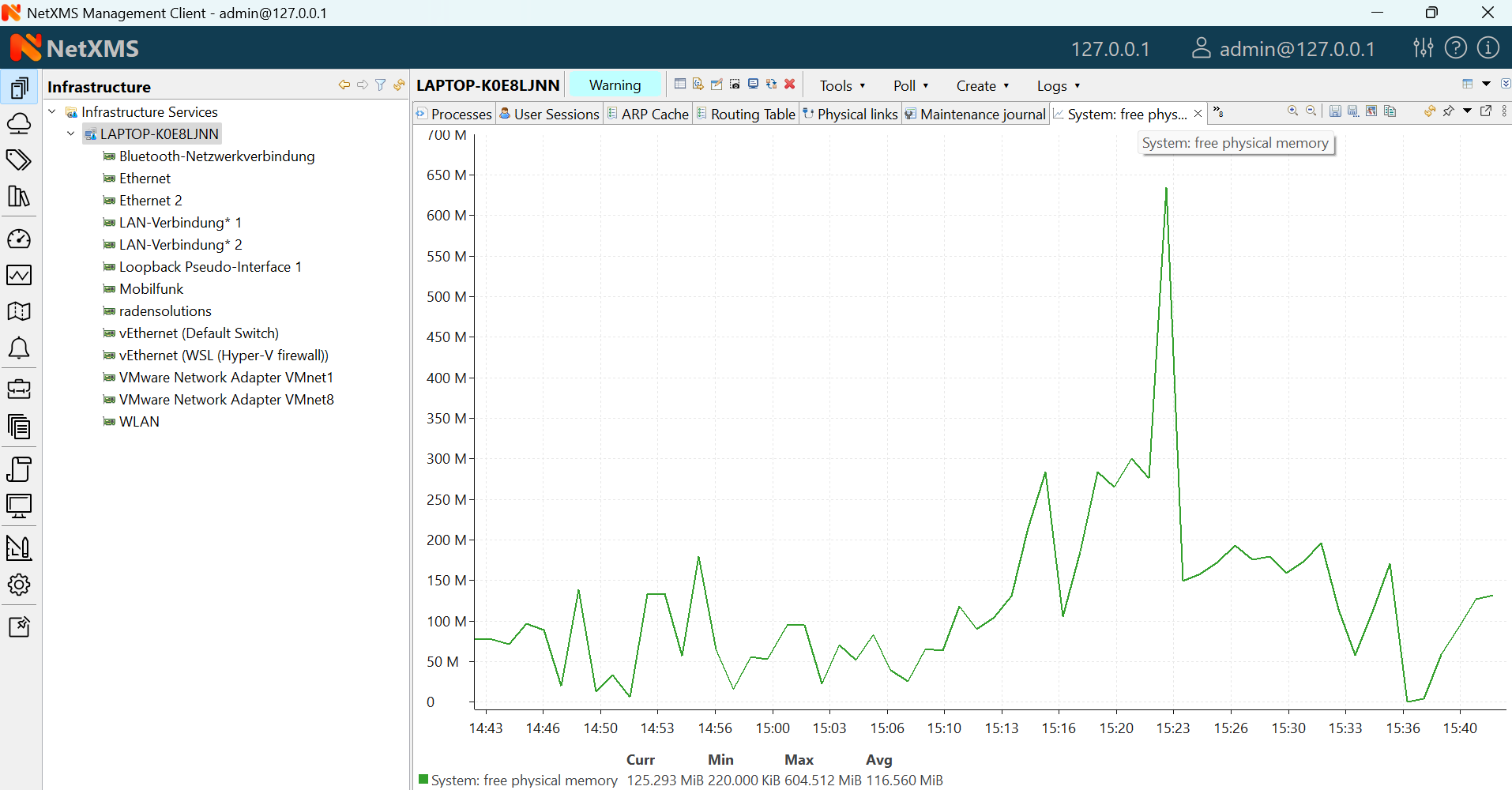
Line graph built from collected data
Performance Tab
Performance tab is a special view that allows to quickly assess health of the selected node using one or more graphs predefined by administrator. Each graph can contain data from multiple DCIs on a node .
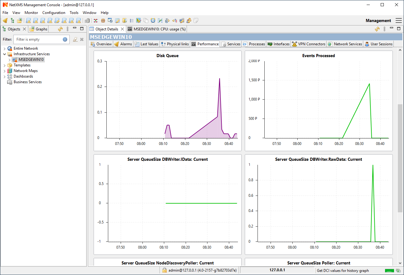
Router’s CPU usage displayed
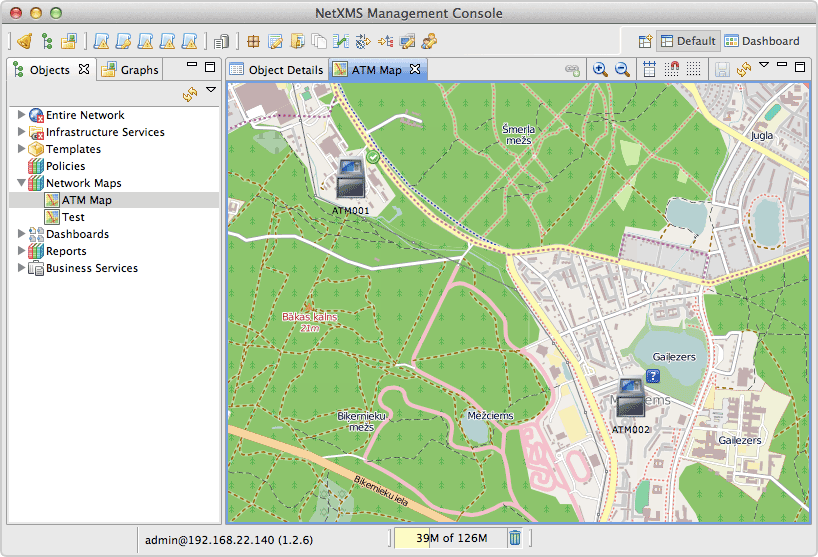
Network Maps
This view allows user to see network overview in a map form. Map can be build and routed either manually or automatically for selected part of the network. Maps can be automatically generated based on:
Layer 2 network topology
IP (layer 3) topology
OSPF topology
Internal communication topology
Automatically built network map based on OSPF topology
To open existing map, left-click on the name in Object Browser.
Reports
NetXMS is integrated with Jasper reporting engine from Jaspersoft. This view allows user to generate report and download result as PDF file. Report generation can take long time, so it’s done in background, without user interaction. When report is generated, resulting PDF can be downloaded any time, as well as any result from previous runs.
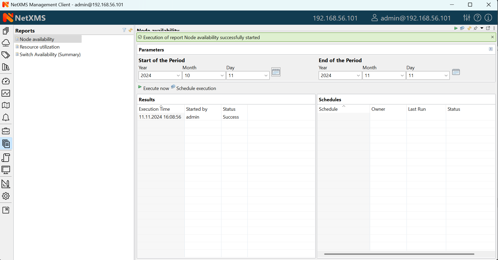
To generate report:
Left-click on report name in Object Browser, report view will open (as show in figure above)
In report view, fill parameters and click Generate Report
You can monitor progress in Server Jobs view. To open it, select .
When report is generated, new finished job will appear in Results table of the view. Select it and click on Render to PDF to download.
When generated report data is not longer needed, it can be deleted from the sever by selecting job in Results view, and then clicking Delete.
Dashboards
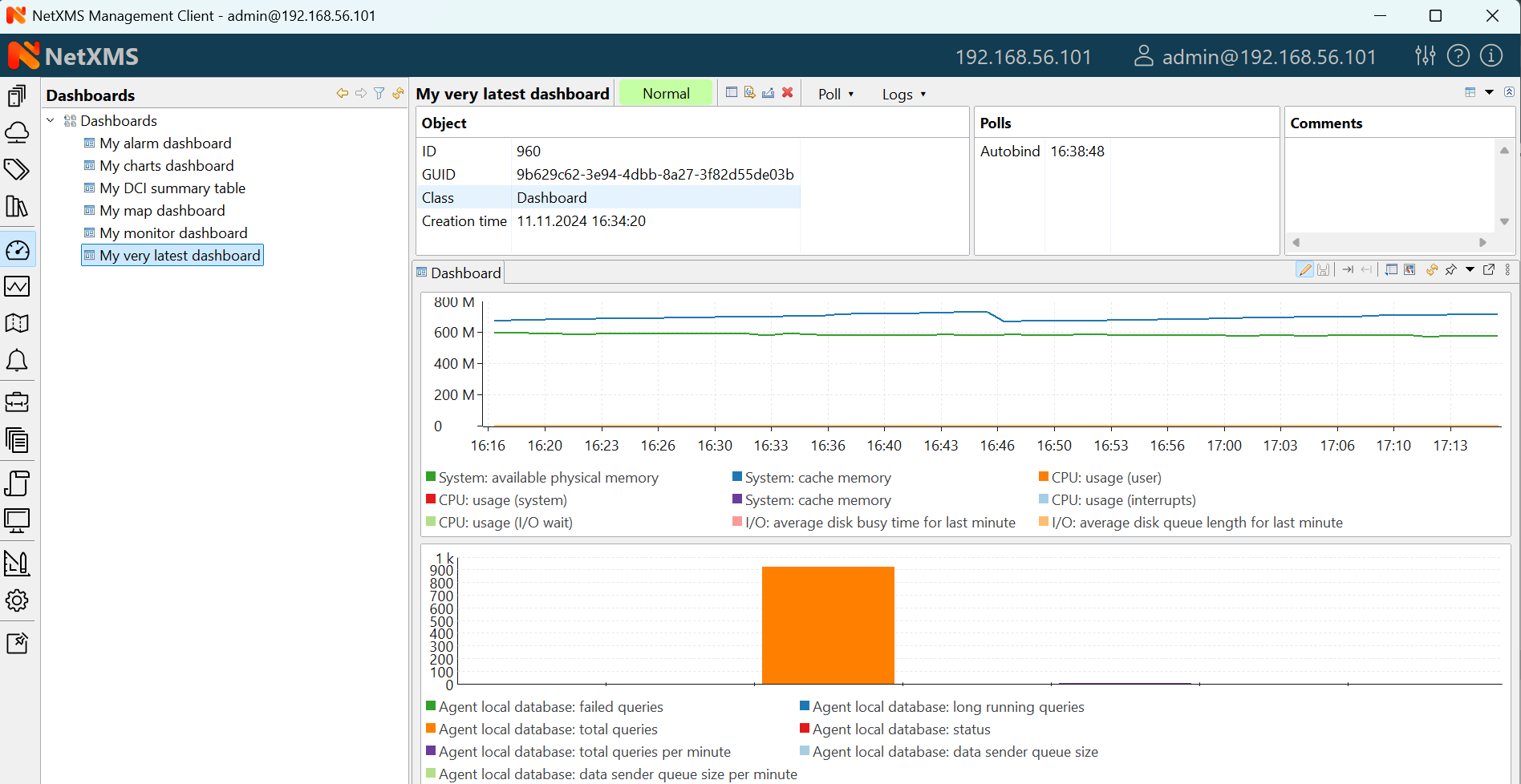
Dashboard showing system and agent DCI readings.
Dashboards are defined by administrator and allow to combine any available visualization components with data from multiple sources in order to create high-level views to see network (or parts of it) health at a glance.
To open a dashboard, switch to Dashboard perspective and select dashboard with left-click.
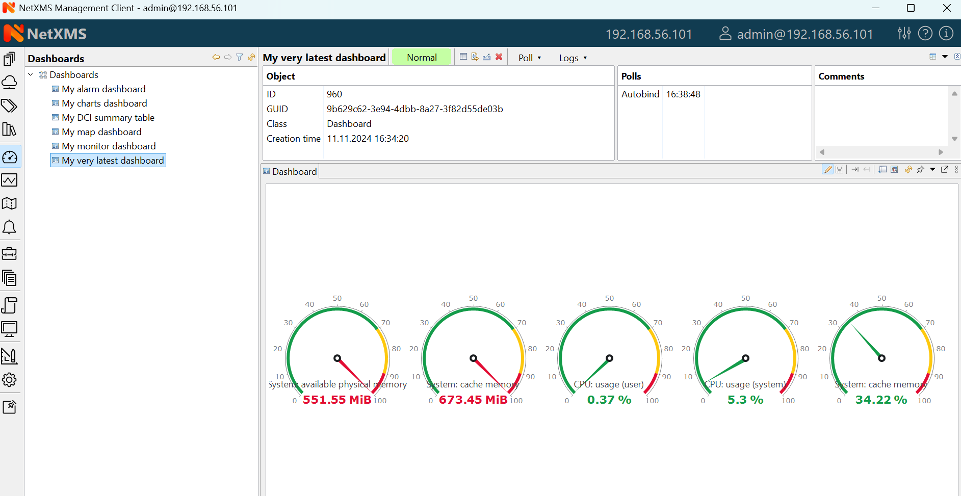
Dashboards perspective
Business Services
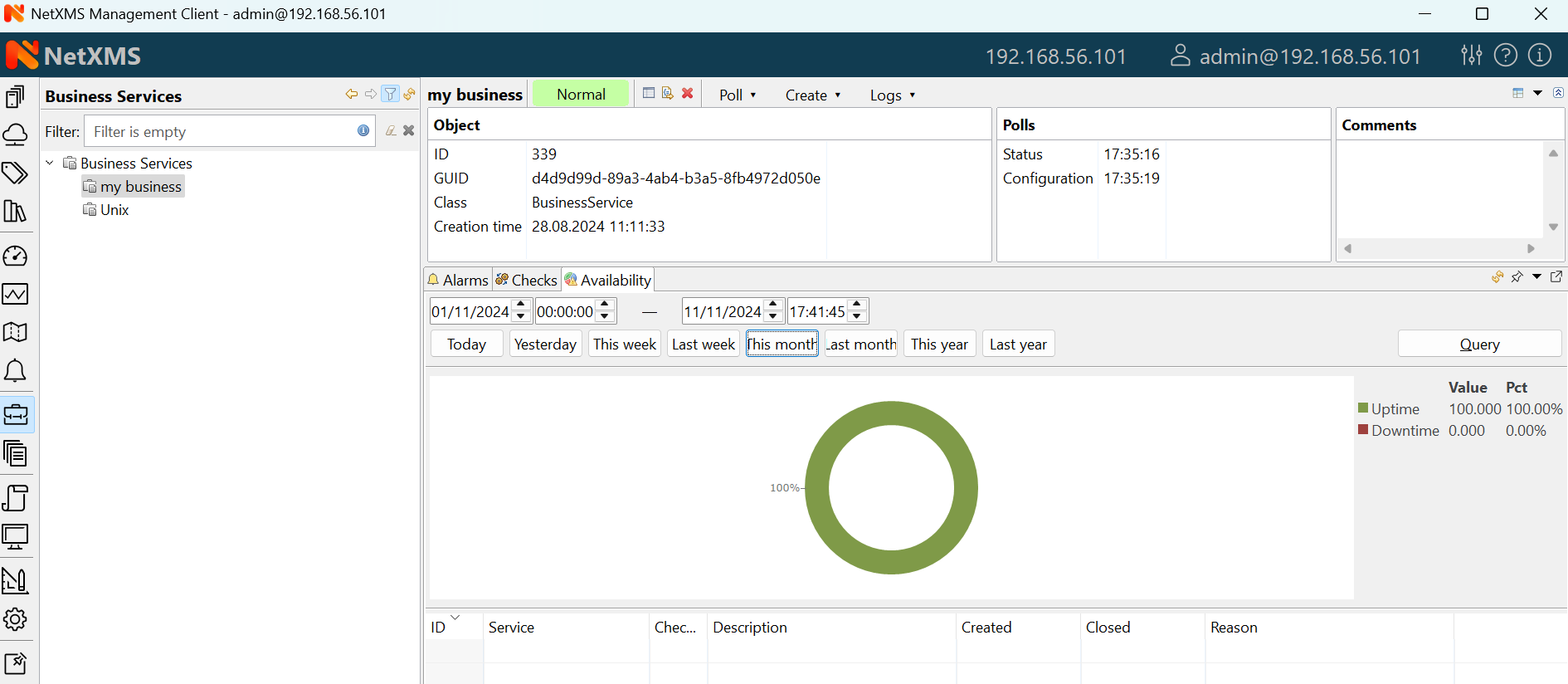
Availability chart and uptime percentage for a system.
Business Services is a hierarchy of logical services as defined by administrator. Each service can represent combined state of multiple elements. For each service in the hierarchy, NetXMS calculates availability percentage and keeps track of all downtime cases. To check availability of any particular level, select it in Object Browser.