Data and Network visualisation
Network Maps
Network maps provide graphical visualization of your network infrastructure, showing objects, their relationships, and current status. Maps can be created manually with custom layouts or generated automatically from topology data.
To access network maps:
Switch to the Maps perspective using the perspective switcher or menu .
In the Object Browser panel, expand Network Maps to see all available maps and map groups.
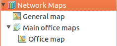
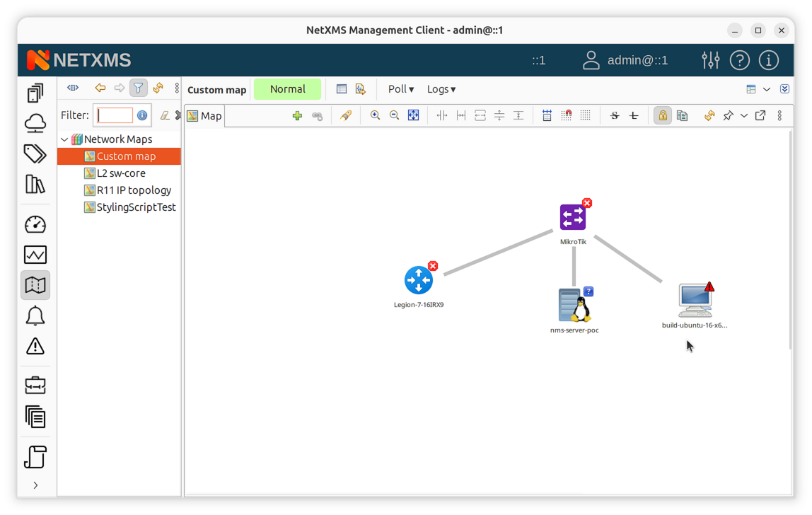
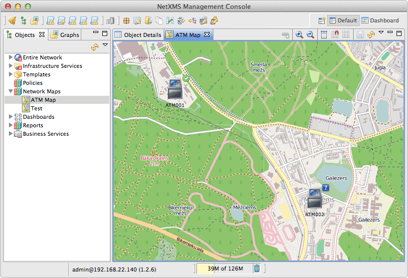
Network maps in Object Browser
Map Types Overview
NetXMS supports six types of network maps:
Type |
Description |
Auto-updates |
|---|---|---|
Custom |
User-defined map with manual object placement |
No |
Layer 2 Topology |
Switching/bridging topology based on MAC tables |
Yes |
IP Topology |
IP routing topology from routing tables |
Yes |
Internal Communication |
Agent/proxy connections to management server |
Yes |
OSPF Topology |
OSPF routing domain topology |
Yes |
Hybrid Topology |
Combined L2/IP/OSPF in single map |
Yes |
Creating Maps
In Object Browser, right-click Network Maps or a map group.
Select Create network map.
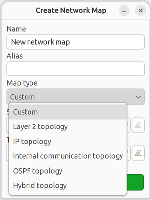
Enter a name and select the map type:
Custom: Empty map for manual creation
Layer 2 Topology: Auto-generated from L2 switching data
IP Topology: Auto-generated from routing tables
Internal Communication Topology: Shows agent/proxy connections
OSPF Topology: Shows OSPF routing relationships
Hybrid Topology: Combines L2, IP, and OSPF data
For automatic topology maps, select the initial seed object in the dialog.
Optionally, select an existing map as a template in the Template network map field. The template provides initial configuration for the new map including:
Map settings (background, size, display mode)
Link defaults (routing, color, width, style)
Filter and link styling scripts
Discovery radius
Decoration elements (group boxes, images)
Text box elements
Object elements and links are not copied from the template.
Create Network Map dialog showing all map types
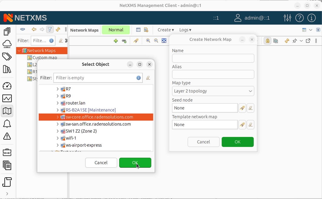
Seed object selection for topology map
Click OK.
Note
IP Topology maps are recommended for getting started as they work with standard routing information available on most devices. Layer 2 Topology maps require specific protocol support (LLDP, CDP, STP) which may not be available or enabled on all network equipment.
Seed Objects and Discovery Radius
For automatic topology maps, seed objects define the starting points for topology discovery. The first seed object is selected when creating the map. Additional seed objects can be added in map properties:
Open map properties (right-click map > Properties).
Go to the Seed Nodes page and click Add to add more seed objects.
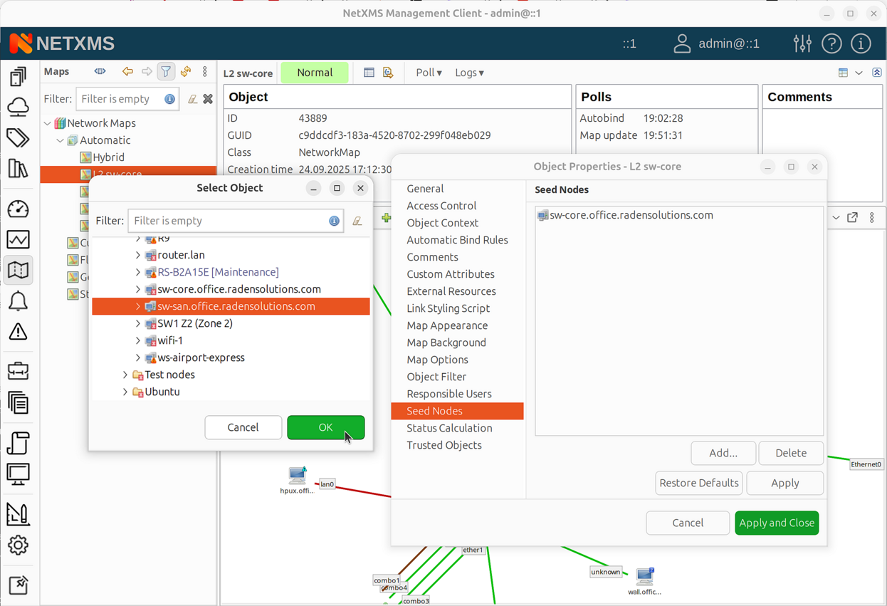
Map properties dialog - Seed Nodes page
Go to the Map Options page to configure discovery radius:
0 = show seed and directly connected objects only
Higher values = include objects further away
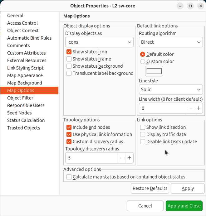
Map properties dialog - Map Options page
Click OK.
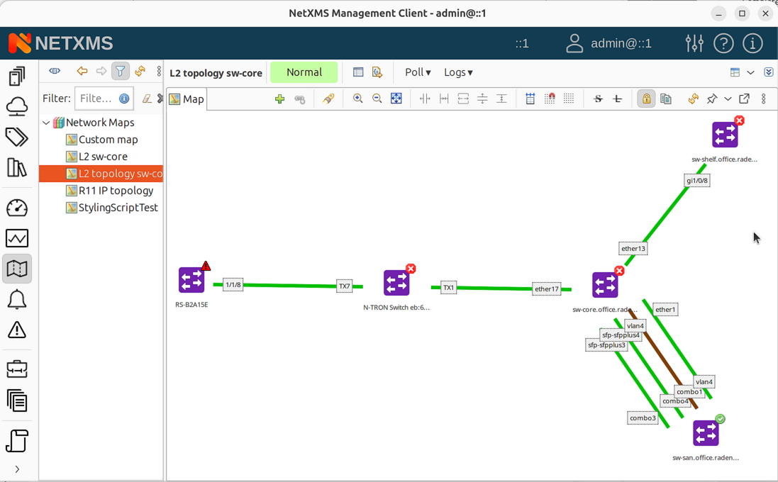
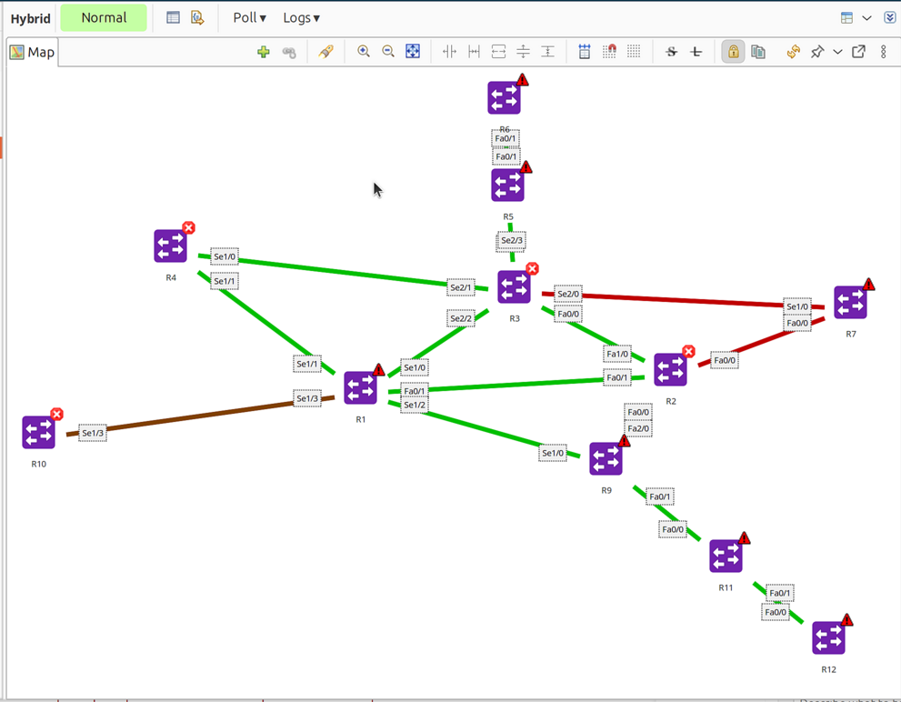
The map automatically populates with discovered topology and updates when the network changes.
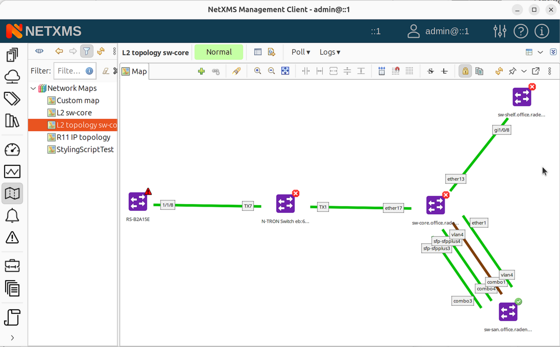
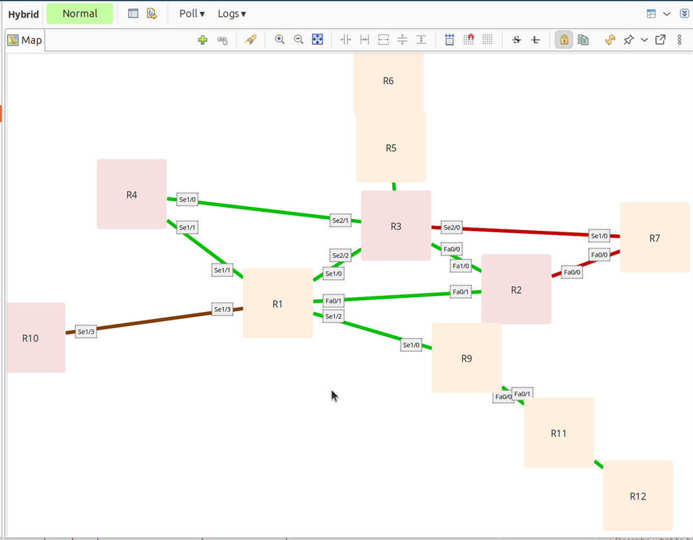
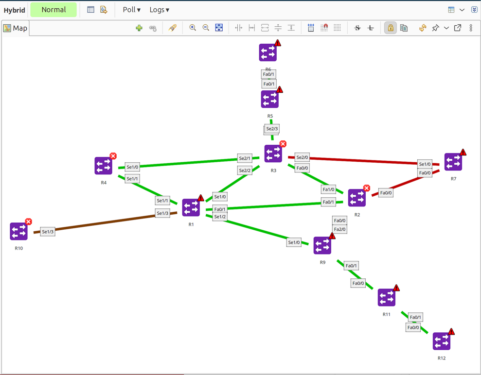
Generated L2 topology map showing discovered nodes and links
Editing Maps
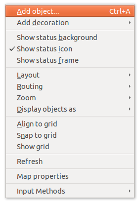
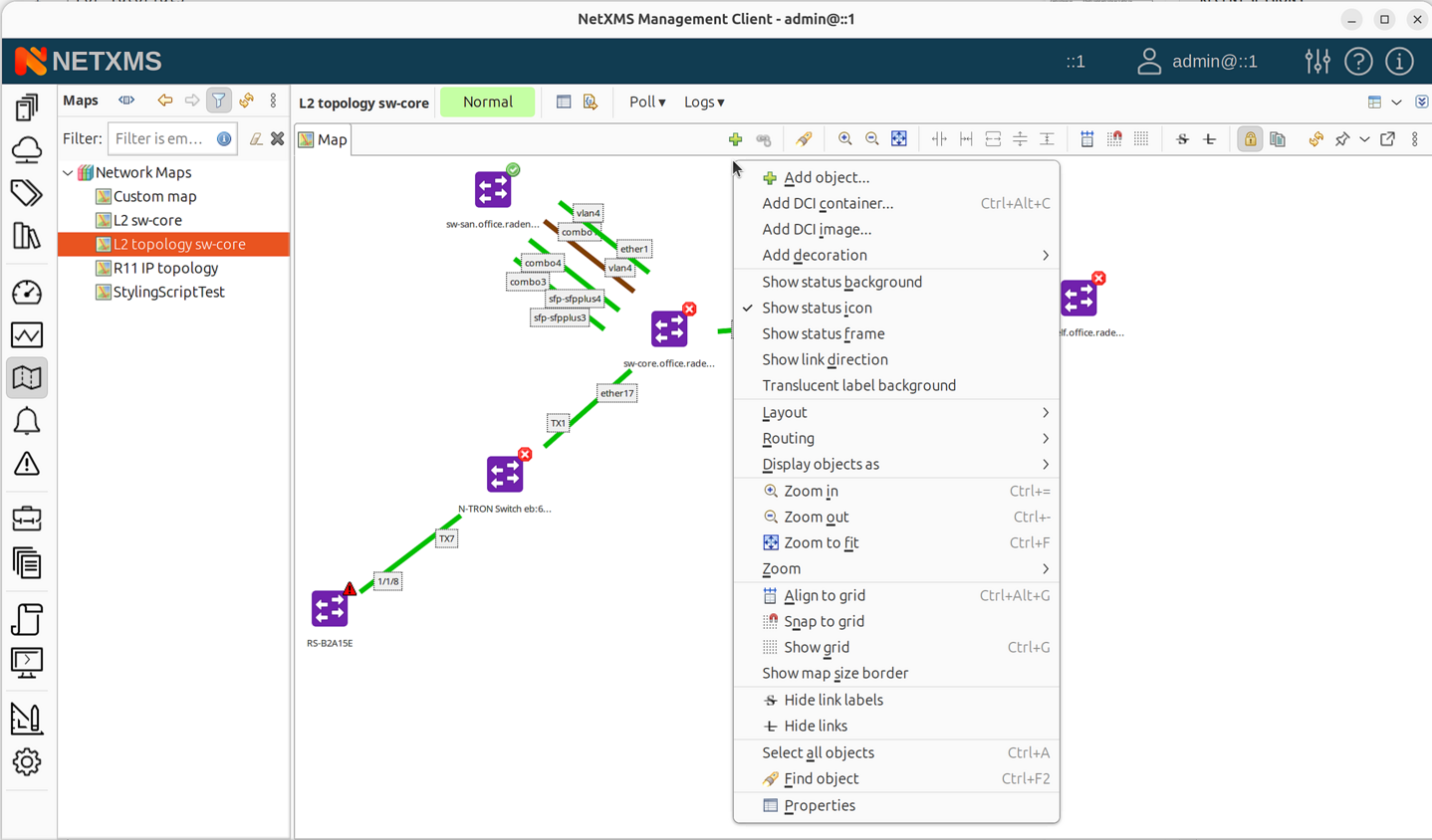
Map context menu
Adding Objects
Network maps can be populated automatically or manually. Layer 2, IP Topology, OSPF, Hybrid, and Internal Communication topology maps are populated automatically.
To add objects manually:
Drag and drop: Drag objects from Object Browser onto the map
Menu: Right-click on map > Add object… > select object
To use drag and drop, the map editor must be accessible while viewing network objects. Either:
Pop out or pin the map editor window, then switch to Network or Infrastructure perspective where objects are located, or
Use the Add object… menu option which works from any perspective
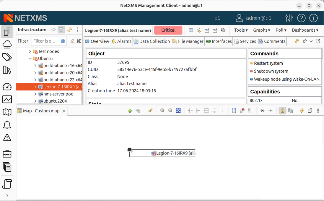
Dragging a node from Object Browser onto a map
To remove objects:
Select object, right-click > Remove from map
Custom map with connected nodes
Adding Links Between Objects
Objects can be linked with a line.
To create links:
Hold Ctrl and click two objects to select them.
Two objects selected before linking
Click Link selected objects in toolbar, or right-click > Link selected objects.
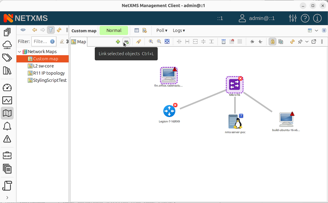
Toolbar with Link selected objects button
To remove links:
Select the link, right-click > Remove from map
Link Properties
Select a link, right-click and select Properties to configure:
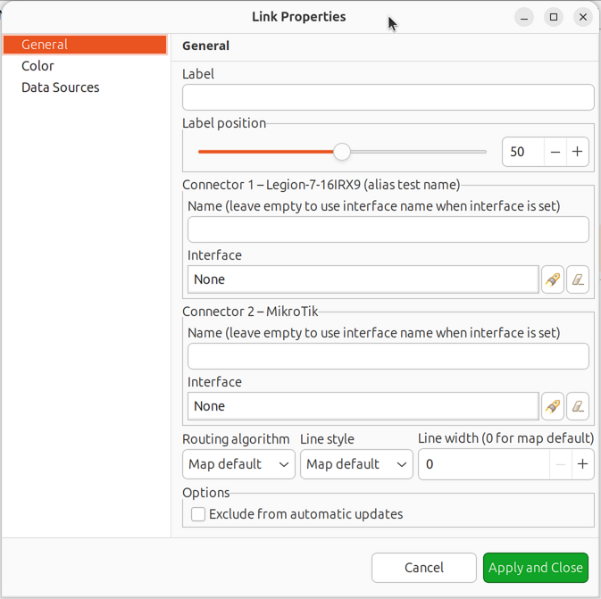
Link properties dialog
Link name: Label displayed on the link
Connector names: Labels shown near each connected object
Line color:
Default - uses map default color
Based on object status - color reflects selected object(s) status
Custom color - user-defined static color
Script - determined by NXSL script
Link utilization - based on interface bandwidth usage
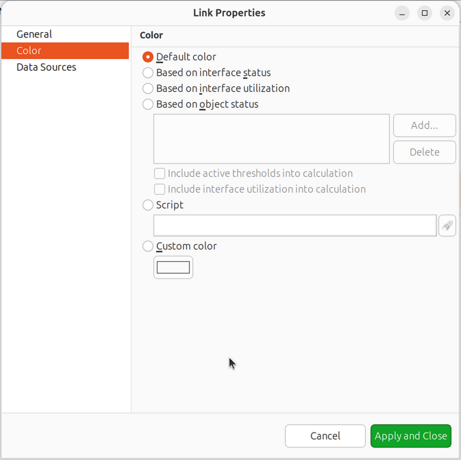
Link color source options
Routing algorithm:
Map Default - uses map setting
Direct - straight line
Manhattan - grid-based with right angles
Bend points - manual routing (double-click line to add points)
Link with manual bend points
Label position: Position of link name and DCI values (50 = middle)
Data Source: Configure DCI values to display on the link
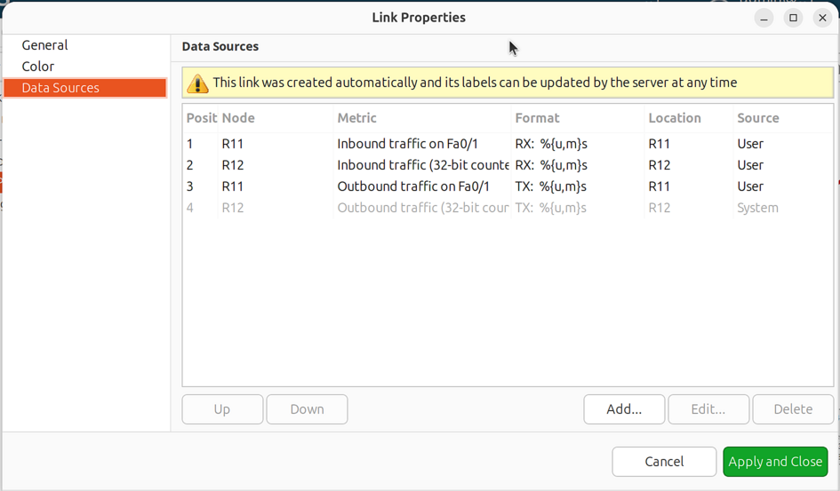
Link data source configuration
Data Source Configuration:
For each data source, configure:
Data collection item
Name (label prefix)
Format string
For table DCIs: column and instance
If format string is not provided, default formatting with multipliers and measurement units is used.
Format string syntax follows Java Formatter specification. Example: Text: %.4f
Additional format specifiers in curly brackets after %:
unitsoru- add measurement units from DCI propertiesmultipliersorm- display with SI multipliers (e.g., 1230000 becomes 1.23 M)Combined:
%{units,multipliers}for%{u,m}f
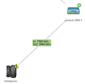
Example of DCI data displayed on a link
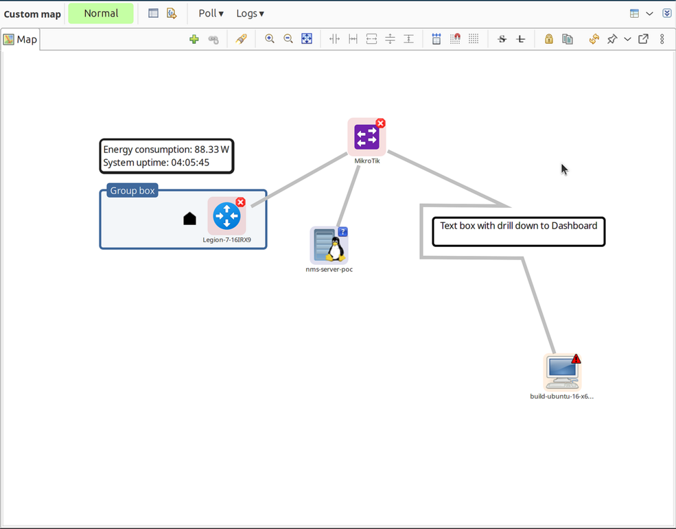
Decorations
Decorations like pictures and group boxes can be added to maps.
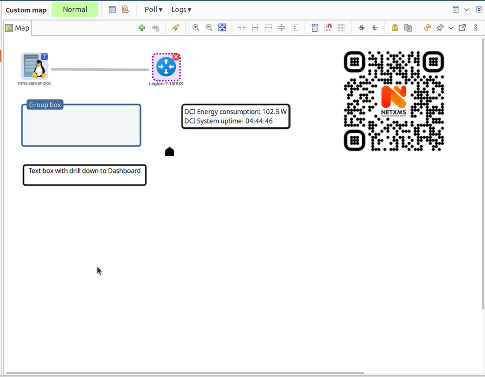
Map decorations example
Group Boxes
Group boxes visually organize related objects.
Right-click on the map canvas.
Select Add decoration > Group box.
Configure: title, color, and size.
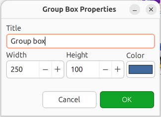
Group box properties dialog
Position behind objects you want to group.
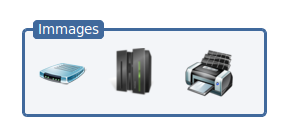
Images
To add an image, first upload it to the Image library, then:
Right-click on the map canvas.
Select Add decoration > Image.
Select the image from the library.
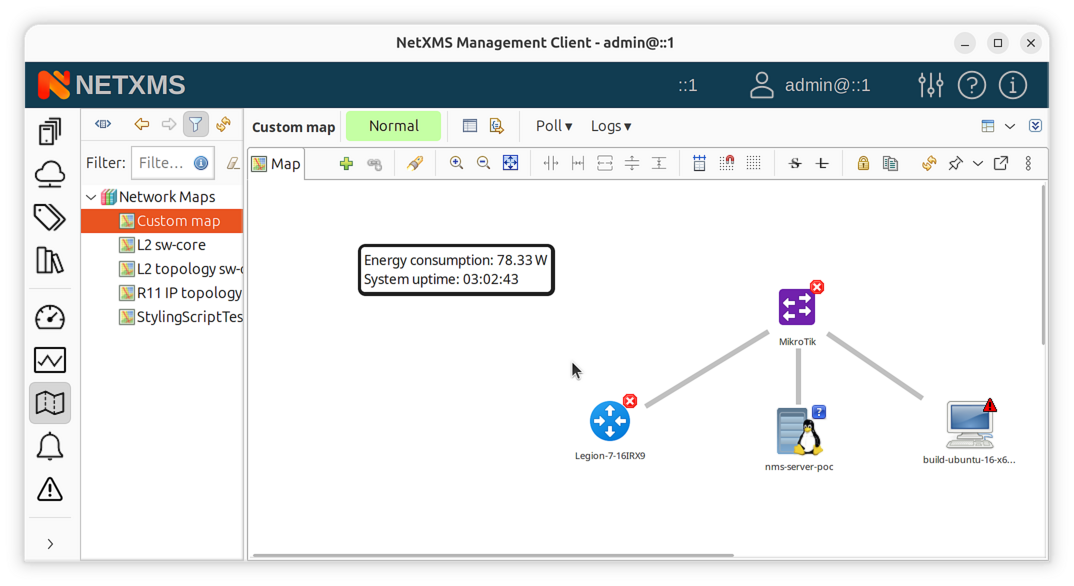
DCI Container
DCI Container displays live DCI values on a map.
DCI Container example
To add a DCI Container:
Right-click on the map canvas.
Select Add DCI container.
Configure appearance:
Background color
Text color
Border (optional) and border color
Add data sources:
Click Add
Select node and DCI
Configure name and format string (e.g.,
Text: %.4for%{u,m}f)For table DCIs: specify column and instance
DCI Container showing live metrics on map
More DCI Container examples
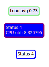
DCI Image
DCI Image displays different images based on DCI values, useful for conditional status indicators.
To add a DCI Image:
Right-click on the map canvas.
Select Add DCI image.
Configure:
Data source: DCI to evaluate
Column/Instance: For table DCIs only
Default image: Shown when no rule matches
Add rules (click Add):
Operation: Comparison operator (>, <, =, etc.)
Value: Threshold value
Image: Image to display when rule matches
Comment: Optional description
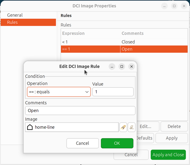
DCI Image rules configuration
Important: Rules are processed top to bottom. Order from most specific to least specific.
Example rule order for temperature:
> 80  => critical.png    (checked first)
> 60  => warning.png     (checked second)
> 0   => normal.png      (checked third)
Text Box
Text boxes display static text with optional drill-down navigation.
To add a Text Box:
Right-click on the map canvas.
Select Add text box.
Configure:
Text: Content to display
Font size: Text size
Colors: Text and background colors
Drill-down object: Optional target for click navigation
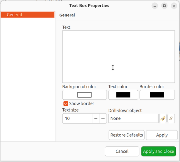
Text Box properties dialog
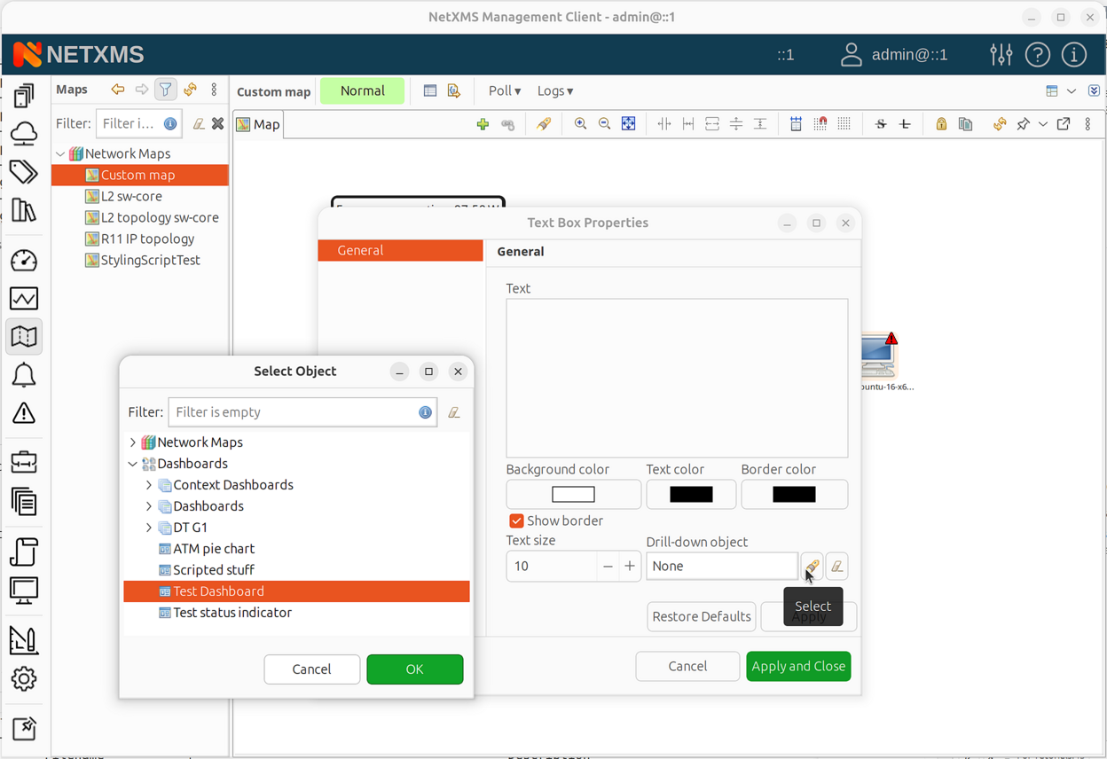
Text Box drill-down object selection
Layout and Display Options
Layout and display options apply to objects, not decorations.
Map Size
Map size defines the canvas dimensions for the network map. This is particularly important for automatically layouted maps, as the layout algorithm uses these dimensions to position objects.
To configure map size:
Open map properties (right-click map > Properties).
Go to the Map Options page.
Set Width and Height values in pixels.
For automatic topology maps, larger dimensions provide more space for the layout algorithm to spread objects, resulting in less cluttered visualization.
Grid
Align to grid: Move all objects to grid positions
Snap to grid: Constrain object movement to grid
Show grid: Display grid lines
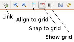
Map toolbar
Layout Algorithms
Objects can be positioned manually or using automatic layouts:
Manual: No automatic positioning (default for Custom maps)
Spring: Force-directed layout
Radial: Circular arrangement from center
Horizontal tree: Left-to-right hierarchy
Vertical tree: Top-to-bottom hierarchy
Sparse vertical tree: Vertical tree with more spacing
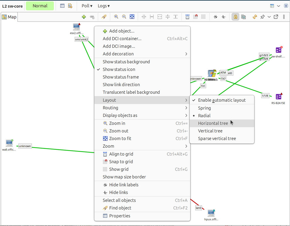
Layout algorithm selection menu
With automatic layout, positions recalculate on each refresh. With manual layout, save the map after moving objects.
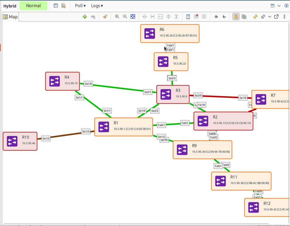
Display Options
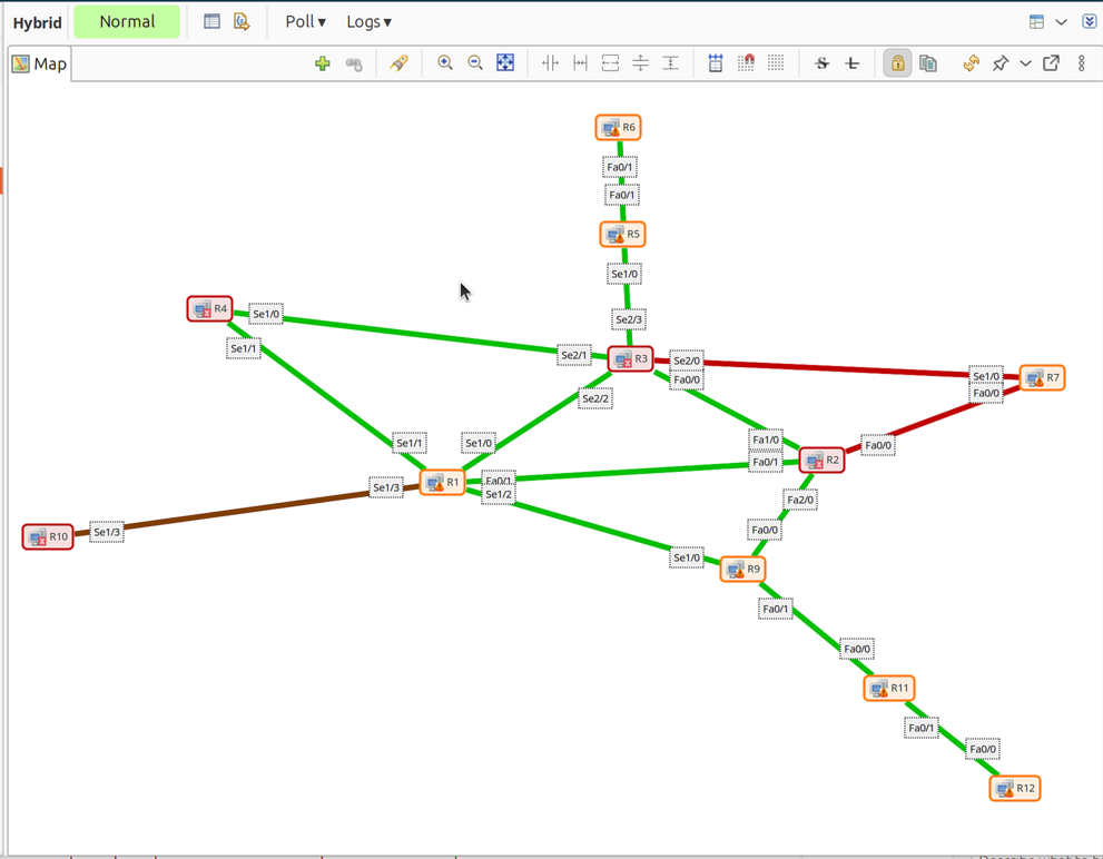
Show status background: Colored background based on object status
Show status icon: Status icon overlay on objects
Show status frame: Colored frame around objects based on status
Floor plan: Objects as resizable rectangles for physical layout
Display options menu with status settings
Map showing objects with status icons
Object Display Mode
Objects can be displayed as:
Icons (default)
Small labels
Large labels
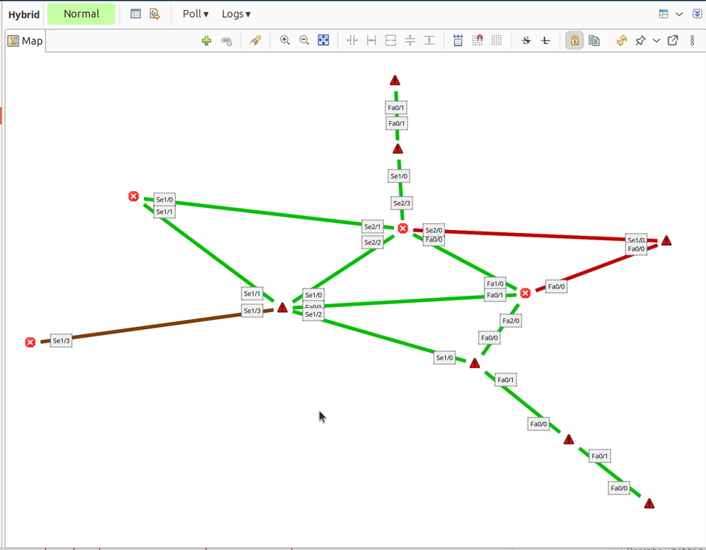
Status icon
Floor plan
Display mode: Icons
Display mode: Small Labels
Display mode: Large Labels
Display mode: Status Icon
Display mode: Floor Plan
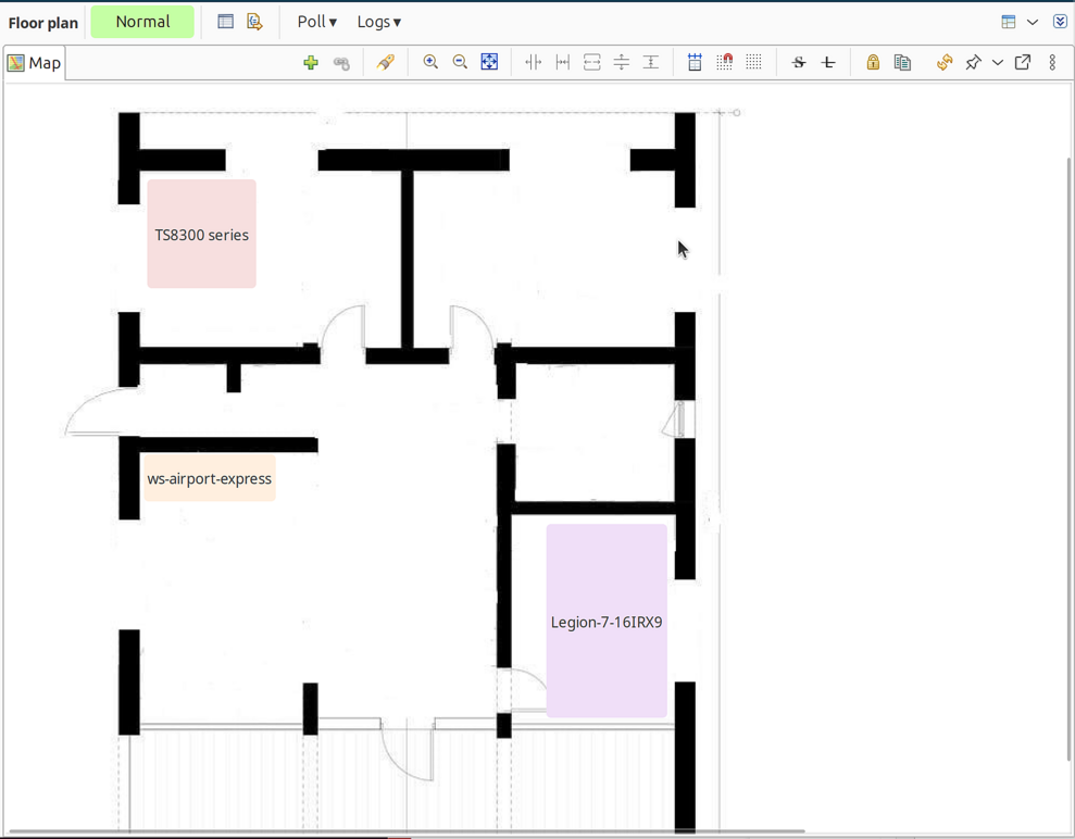
Map in floor plan mode with resizable rectangles
Default Link Routing
Direct: Straight lines
Manhattan: Grid-based with right angles
Zoom
Map can be zoomed using toolbar buttons or selecting a percentage from the menu.
Public Access
When NetXMS WebUI is configured, network maps can be shared publicly via a direct URL without requiring authentication. This is useful for displaying maps on information screens or sharing with users who don’t have system accounts.
To enable public access:
Right-click on a network map in Object Browser.
Select Enable public access…
A dialog appears with:
Access token: Unique token for this map’s public access
Direct access URL: Full URL to access the map
Copy the URL and share it as needed.
The URL format is:
{BaseURL}/nxmc-light.app?auto&kiosk-mode=true&token={token}&map={mapId}
The map will be displayed in kiosk mode without navigation elements, suitable for dashboards and information displays.
Note
Public access requires WebUI to be properly configured with a base URL. Each time you enable public access, a new token is generated.
Delegated Access
Network maps can display objects that users don’t have direct read access to, using the Delegated read access right. This is useful for creating overview maps for users who should see network visualization without having full access to browse the underlying nodes.
Delegated read only allows viewing objects through the map interface. Users cannot browse these objects directly in Object Browser or access them outside the map context.
Delegated read can be set on specific objects, on containers or on root objects, e.g. on Infrastructure Services.
Added in version 5.0.
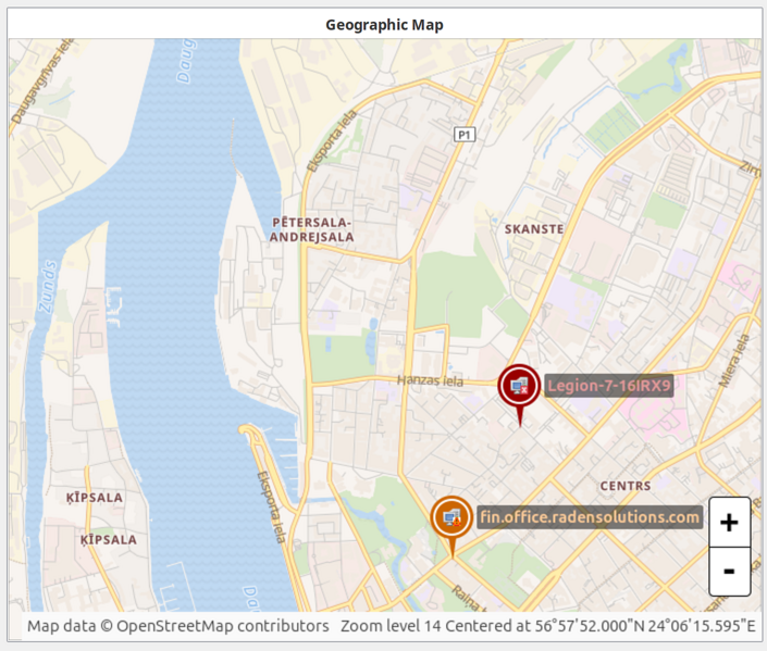
Map Background
Background options:
Color: Solid background color
Image: Upload to Image library first, then select
Geographic Map: Specify latitude, longitude, and zoom level
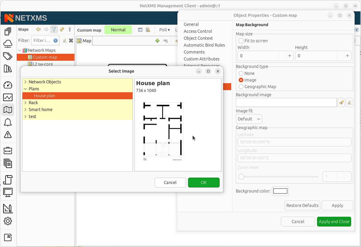
Image background selection from Image Library
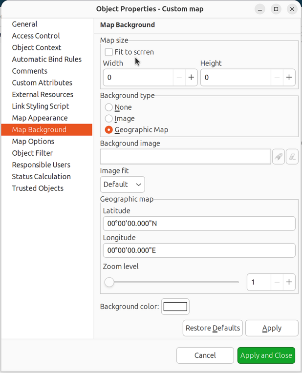
Geographic map background configuration
Use backgrounds to show physical placement on floor plans or geographic locations.
Map with geographic background
Object Filter Script
Filter scripts control which objects appear on automatic topology maps.
Open map properties.
Go to the Filter tab.
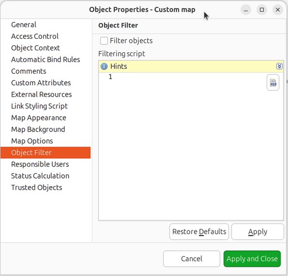
Map properties - Filter script configuration
Enter an NXSL script returning
true(include) orfalse(exclude).Enable Filter objects option.
Context variables:
$objector$node: Object being evaluated$map: The NetworkMap object
Example - include only nodes:
return $object.isNode;
Example - exclude nodes in maintenance:
return !$node.isInMaintenanceMode;
Example - include only specific subnet:
if ($node.ipAddr.inSubnet("10.1.0.0", 16))
   return true;
return false;
Link Styling Script
Link styling scripts dynamically modify link appearance during map updates.
Open map properties.
Go to the Link Styling Script section.
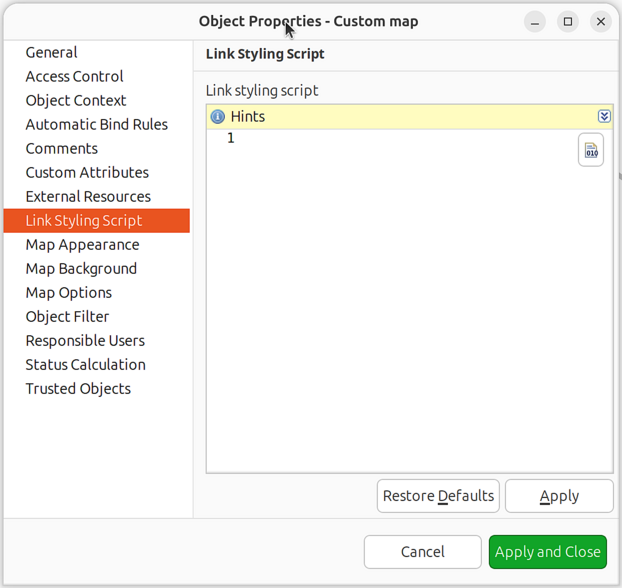
Map properties - Link styling script configuration
Enter an NXSL script that modifies the
$linkobject.
Example - set link width based on bandwidth:
iface = $link.interface1;
if (iface != null) {
   speed = iface.speed;
   if (speed >= 10000000000)
      $link.setWidth(4);  // 10G+
   else if (speed >= 1000000000)
      $link.setWidth(3);  // 1G
   else
      $link.setWidth(2);  // Below 1G
}
Example - add interface descriptions as connector names:
if ($link.interface1 != null)
   $link.setConnectorName1($link.interface1.description);
if ($link.interface2 != null)
   $link.setConnectorName2($link.interface2.description);
For complete NXSL reference including all available methods and attributes for
$link object, see NetworkMapLink class
in the NXSL documentation.
Reference Tables
Map Types
Type |
Description |
Auto-updates |
Seed Required |
|---|---|---|---|
Custom |
User-defined manual map |
No |
No |
Layer 2 Topology |
Switching/bridging topology |
Yes |
Yes |
IP Topology |
IP routing topology |
Yes |
Yes |
Internal Communication |
Agent/proxy connections |
Yes |
Yes (auto) |
OSPF Topology |
OSPF routing topology |
Yes |
Yes |
Hybrid Topology |
Combined L2/IP/OSPF |
Yes |
Yes |
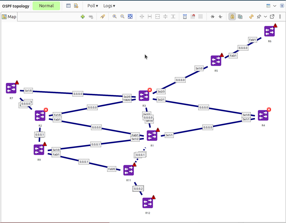
OSPF topology map showing router relationships
Hybrid topology map combining L2/IP/OSPF
Element Types
Type |
Description |
|---|---|
Object |
Managed NetXMS object (node, interface, etc.) |
Decoration |
Group box or static image |
DCI Container |
Live DCI value display |
DCI Image |
Dynamic image based on DCI value |
Text Box |
Text annotation with optional drill-down |
All element types shown on one map
Link Types
Type |
Visual |
Description |
|---|---|---|
Normal |
Solid line |
Standard connection |
VPN |
Dashed |
VPN tunnel |
Multilink |
Double line |
Aggregated links (LAG) |
Agent Tunnel |
Red indicator |
Agent tunnel connection |
Agent Proxy |
Green indicator |
Agent proxy |
SSH Proxy |
Cyan indicator |
SSH proxy |
SNMP Proxy |
Yellow indicator |
SNMP proxy |
ICMP Proxy |
Blue indicator |
ICMP proxy |
Sensor Proxy |
Default color |
Sensor proxy |
Zone Proxy |
Magenta indicator |
Zone proxy |
Link Color Sources
Source |
Description |
|---|---|
Default |
Uses map default color |
Object Status |
Based on selected object(s) status |
Custom Color |
User-defined static color |
Script |
Determined by NXSL script |
Link Utilization |
Based on interface utilization |
Interface Status |
Based on interface operational status |
Layout Algorithms
Algorithm |
Description |
|---|---|
Manual |
User positions objects |
Spring |
Force-directed layout |
Radial |
Circular arrangement |
Horizontal Tree |
Left-to-right tree |
Vertical Tree |
Top-to-bottom tree |
Sparse Vertical Tree |
Spread-out vertical tree |
Link Routing
Algorithm |
Description |
|---|---|
Default |
Uses map setting |
Direct |
Straight line |
Manhattan |
Grid-based with right angles |
Bendpoints |
User-defined routing points |
Link Styles
Style |
Description |
|---|---|
Default |
System default (solid) |
Solid |
Continuous line |
Dash |
Dashed line |
Dot |
Dotted line |
Dash-Dot |
Alternating dash and dot |
Dash-Dot-Dot |
Dash and two dots |
NXSL Classes Reference
For scripting with network maps, refer to the NXSL documentation:
NetworkMap class - Map object available as
$mapNetworkMapLink class - Link object available as
$link
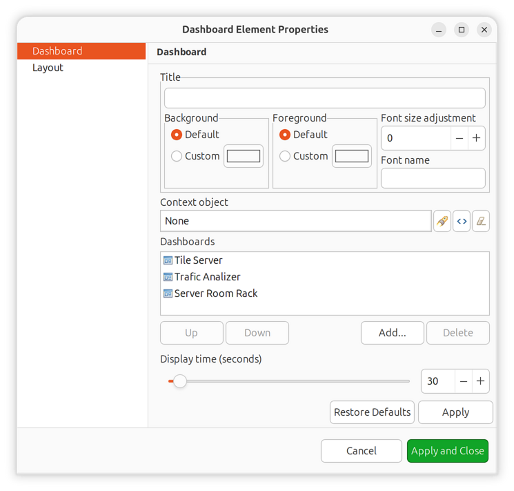
Dashboards
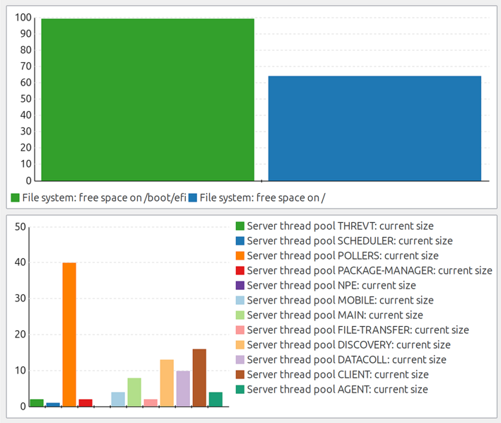
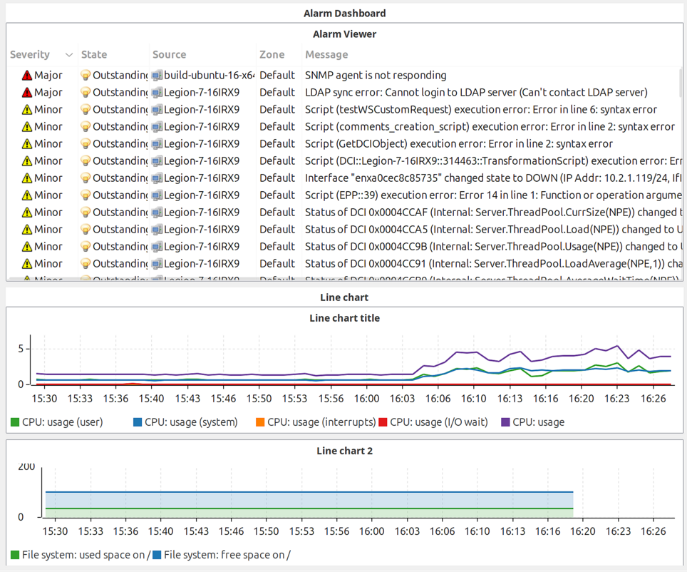
Dashboards combine visualization components with data from multiple sources to create high-level views for monitoring network health at a glance. Administrators create dashboards to display charts, status indicators, alarm lists, geographic maps, and other elements in a customizable grid layout.
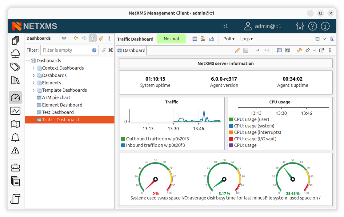
Example dashboard showing traffic information and CPU usage
Accessing Dashboards
To access dashboards, switch to the Dashboard perspective and select the desired dashboard from the object tree on the left.
Creating Dashboards
Dashboards are objects created in the Dashboards container in the object tree. To create a new dashboard:
Right-click on Dashboards root or any existing dashboard
Select Create dashboard
Enter a name for the dashboard
Open the dashboard’s properties to configure elements
Dashboard Properties
To configure dashboard content, open the object’s properties and navigate to Dashboard Elements. Here you can define the number of columns and manage the list of elements.
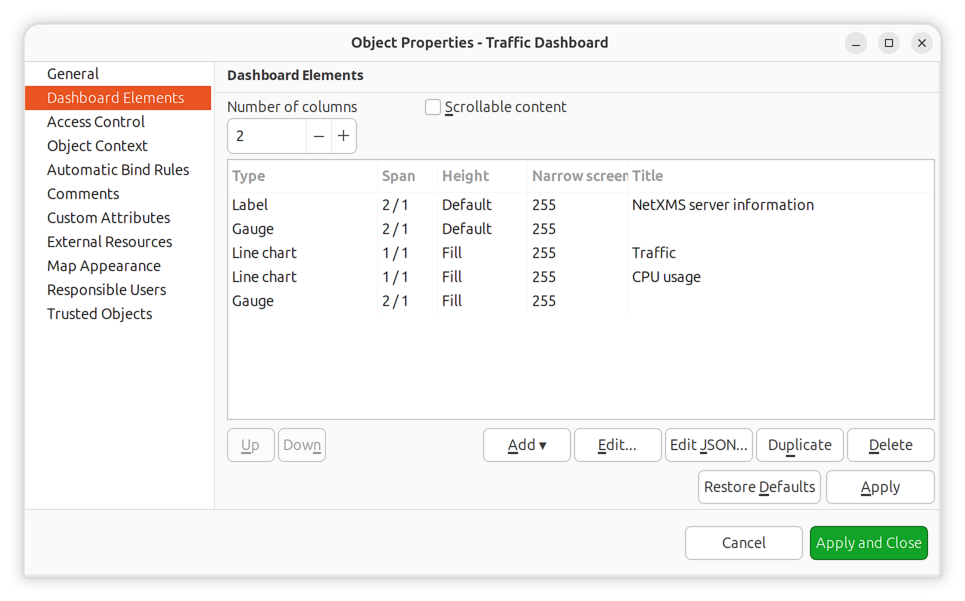
Dashboard properties dialog
Property |
Description |
|---|---|
Number of columns |
Defines the grid width for element layout |
Scrollable |
Enable vertical scrolling when content exceeds viewport height |
Press Add to add a new element. You will be prompted with an element type selection menu.
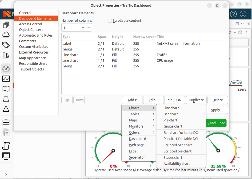
Element type selection menu
When a new element is added, double-click on its record in the elements list or press Edit to configure it. Each element has a Layout property page controlling the element’s position within the dashboard, plus one or more element-specific pages.
Dashboard Templates
Dashboard templates allow you to create reusable dashboard designs that automatically generate dashboards for objects matching specified criteria.
To create a dashboard template:
Right-click on Dashboards and select Create dashboard template
Configure elements as with regular dashboards
Set up auto-bind filter to specify which objects should receive this dashboard
When an object matches the auto-bind filter, a dashboard instance is automatically
created and linked to that object. The name template field allows you to define
how generated dashboard names are formatted using
macro substitution (e.g. %n for object name).
Dashboard Auto-Bind
Dashboards support automatic binding to objects using NXSL filter scripts. When enabled, dashboards will automatically bind to (and optionally unbind from) objects that match the filter criteria.
Configure auto-bind in dashboard properties:
Property |
Description |
|---|---|
Enable auto-bind |
Automatically bind dashboard to matching objects |
Enable auto-unbind |
Automatically unbind from objects that no longer match |
Auto-bind filter |
NXSL script that returns |
Example auto-bind filter to bind to all Linux nodes:
return $node->platformName ~= "Linux";
Context Dashboards
Context dashboards are displayed as views within an object’s context, rather than as standalone dashboards. This allows creating object-specific monitoring views that appear when viewing a particular node, container, or other object.
To enable context dashboard mode, open the dashboard’s properties and navigate to the Object Context property page:
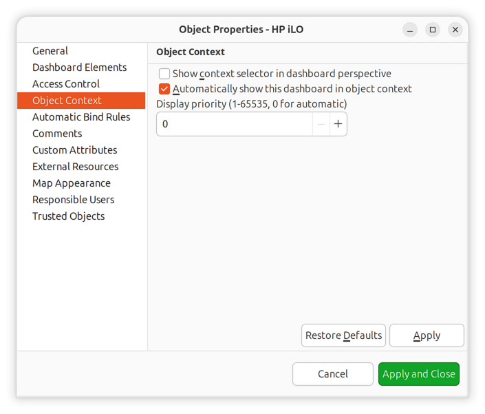
Object Context property page
Property |
Description |
|---|---|
Show context selector in dashboard perspective |
Display object selector when dashboard is viewed in the Dashboard perspective, allowing users to switch context object |
Automatically show this dashboard in object context |
When enabled, dashboard will appear as a tab in bound objects’ context views |
Display priority (1-65535, 0 for automatic) |
Controls tab ordering when multiple dashboards are shown in object context. Lower values appear first. Set to 0 for automatic ordering. |
To associate a context dashboard with objects, use auto-bind to define which objects should display this dashboard.
When a context dashboard is bound to an object, it appears in that object’s view tabs alongside other context views.
Dashboard Elements
Dashboard elements are the building blocks of dashboards. There are 32 element types available, organized into functional categories.
Labels and Text
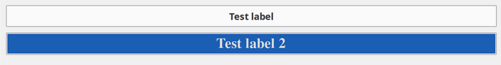
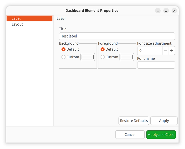
Label
Text label with configurable text and colors. Supports multi-line text and basic formatting.
Charts
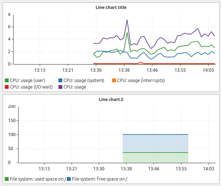
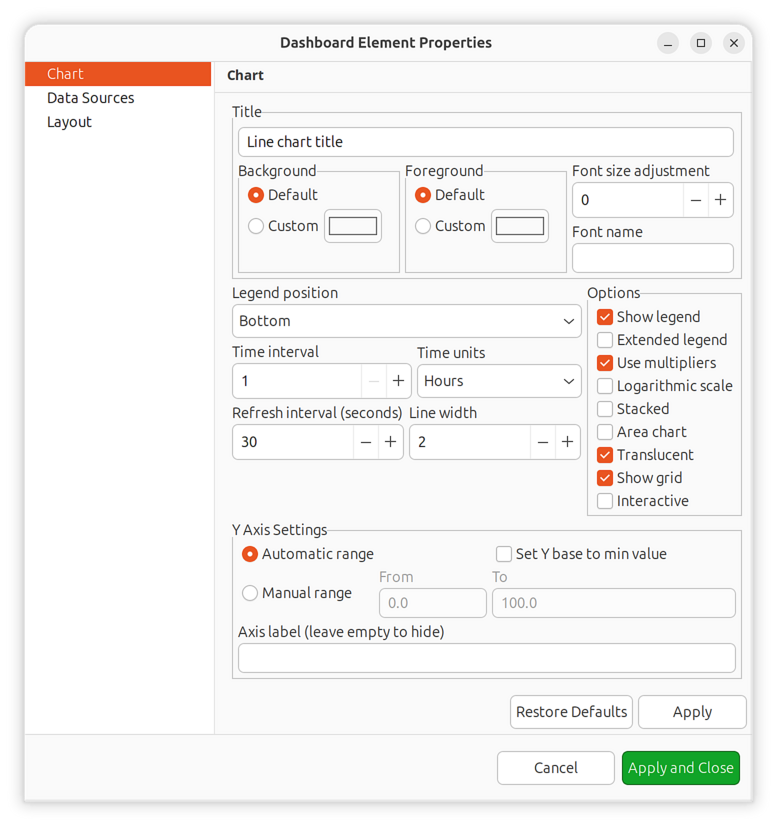
Line Chart
Displays time-series data as line graphs with configurable time ranges. Supports up to 16 data sources per chart.
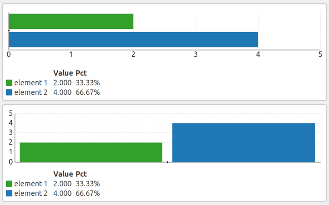
Bar Chart
Displays data as vertical or horizontal bars. Useful for comparing values across multiple data sources.
Pie Chart
Shows proportional data distribution as pie segments.
Tube Chart
Deprecated since version 4.2: Use Bar Chart instead.
Displays data as a tube/cylinder visualization. Included for backward compatibility with existing dashboards.
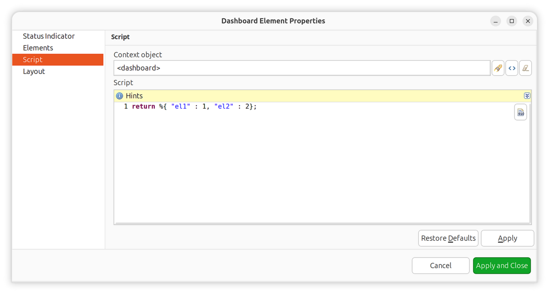
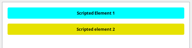
Scripted Charts
Scripted charts use NXSL scripts to dynamically generate chart data rather than reading directly from DCIs. This allows complex data transformations and aggregations.
Scripted Bar Chart
Bar chart with script-defined data. The script runs in the context of a selected object and returns data for chart segments.
Configuration:
Object: Context object for script execution (or dashboard context if not set)
Script: NXSL script that returns a hash map with chart data
The script must return a hash map where keys are segment labels and values are numeric values:
return %{"Segment A": 10, "Segment B": 17, "Segment C": 42};
Values can also be JSON strings with additional properties for custom display names and colors:
return %{
   "key1": '{"name": "Display Name", "color": "#FF0000", "value": 42}',
   "key2": '{"name": "Another", "color": "#00FF00", "value": 58}'
};
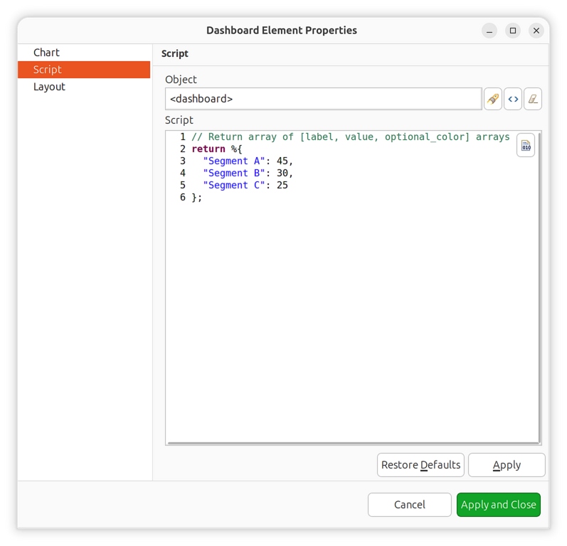
Scripted chart configuration
Scripted Pie Chart
Pie chart with script-defined data. Uses the same configuration and script format as the Scripted Bar Chart.
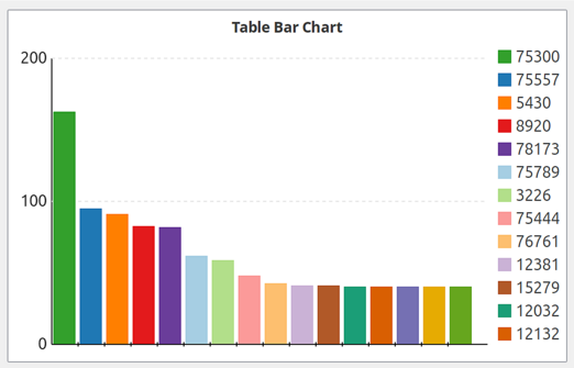
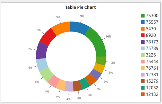
Table-Based Charts
These charts visualize data from table DCIs (data collection items that return multiple rows).
Bar Chart for Table DCI
Bar chart displaying data from a table DCI. Configure the column to use for labels and values.
Pie Chart for Table DCI
Pie chart displaying data from a table DCI.
Tube Chart for Table DCI
Tube visualization of table DCI data. Deprecated but supported for backward compatibility.
Gauge Charts
Gauges display single numeric values with configurable scales and color zones.
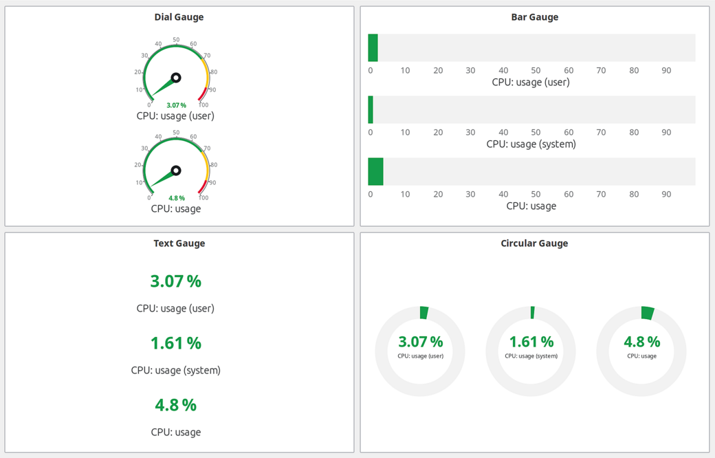
Gauge element types: Dial, Bar, Text, and Circular
Gauge Types:
Type |
Description |
|---|---|
Dial |
Radial gauge with needle indicator. Classic speedometer-style display. |
Bar |
Linear bar gauge (horizontal or vertical). |
Text |
Numeric text display with optional color coding based on value ranges. |
Circular |
Modern circular arc gauge with smooth gradient coloring. |
Color Zones:
Gauges support color zones to visually indicate value ranges:
Left Red Zone: Minimum value to left red threshold (critical low)
Left Yellow Zone: Left red threshold to left yellow threshold (warning low)
Normal Zone: Between left and right yellow thresholds (normal)
Right Yellow Zone: Right yellow threshold to right red threshold (warning high)
Right Red Zone: Right red threshold to maximum value (critical high)
Color Modes:
Zone: Color changes based on which zone the value falls into
Custom: Single custom color for the entire gauge
Threshold: Color based on DCI threshold severity
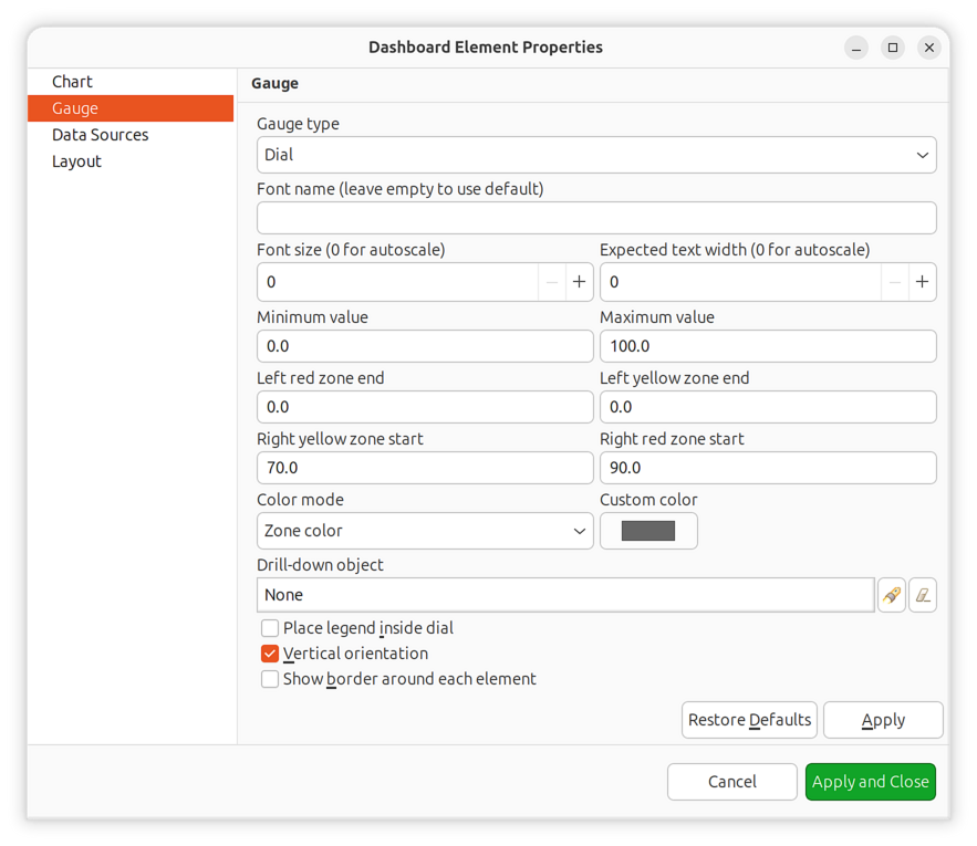
Gauge color zones configuration
Status Elements
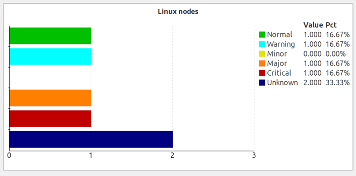
Status Chart
Bar chart showing current status distribution for objects under a specified root object. Displays counts of objects in each status level (Normal, Warning, Minor, Major, Critical, etc.).
Status Indicator
Shows the current status of one or more objects as colored shapes. Supports multiple display modes and data sources.
Element Types:
Type |
Description |
|---|---|
Object |
Display status of a specific object |
DCI |
Display status based on a specific DCI’s threshold state |
DCI Template |
Display status from DCIs matching a name/description pattern |
Script |
Calculate status using an NXSL script |
Shapes:
Circle (default)
Rectangle
Rounded Rectangle
Label Position:
None (no label)
Inside (label within the shape)
Outside (label below/beside the shape)
Script-Driven Mode:
When using script element type, a single NXSL script is configured at the widget level and provides status for all script-type elements. Each script-type element has a tag field that is used as a key to look up its status from the script result.
The script must return a hash map where keys match element tags and values are integer status codes:
Value |
Status |
|---|---|
0 |
Normal |
1 |
Warning |
2 |
Minor |
3 |
Major |
4 |
Critical |
5 |
Unknown |
Example script:
return %{"cpu": $object->status, "memory": 3, "disk": 0};
In this example, elements with tags cpu, memory, and disk must be
defined on the elements configuration page. If an element’s tag is not present
in the returned map, that element will be hidden.
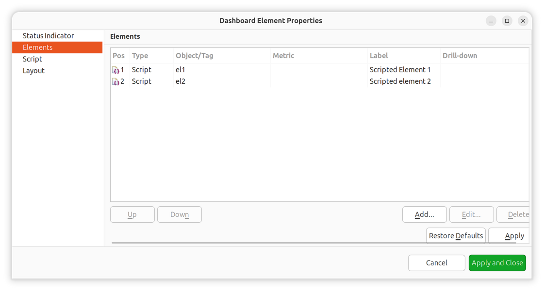
Status indicator elements configuration with tags
Script configuration
Script-driven status indicator result
Status Map
Displays object hierarchy as a visual status map with three view modes.
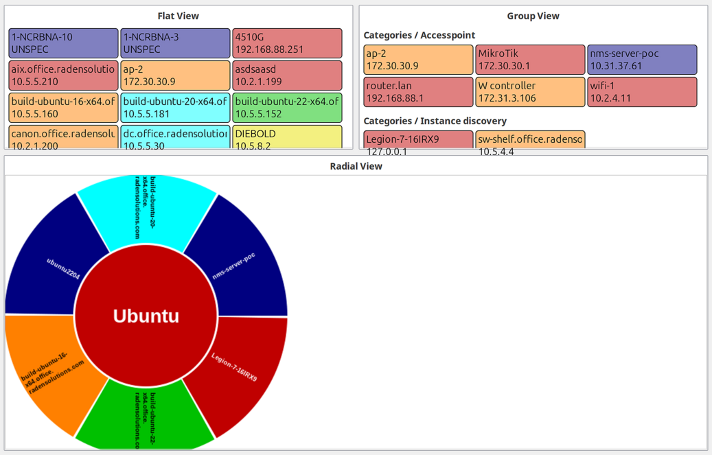
View Modes:
Flat: All objects displayed as equal-sized rectangles without grouping
Group: Objects grouped by their containers
Radial: Hierarchical radial layout with parent in center
Monitors
Alarm Viewer
Displays active alarms for a specified object subtree.
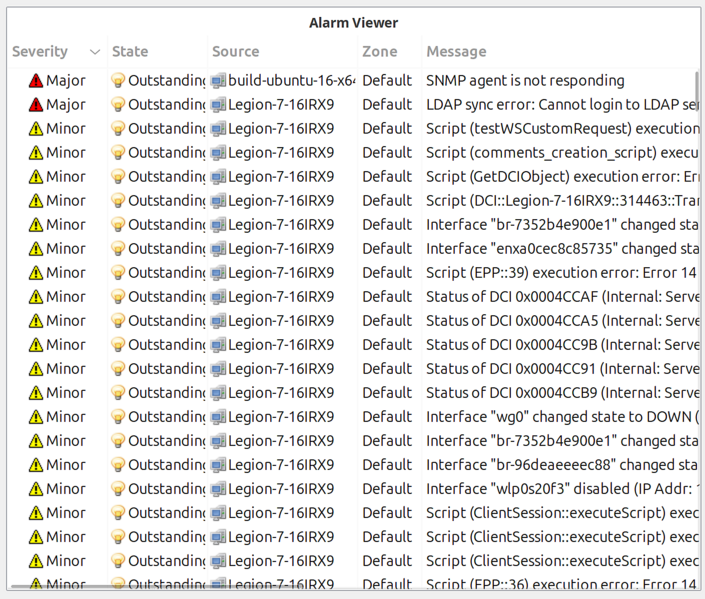
Filter Options:
Property |
Description |
|---|---|
Root object |
Show alarms only for this object and its children |
Severity filter |
Bitmask to show only specific severity levels |
State filter |
Bitmask to show only specific states (outstanding, acknowledged, resolved) |
Local sound |
Enable audio notification for new alarms in this widget |
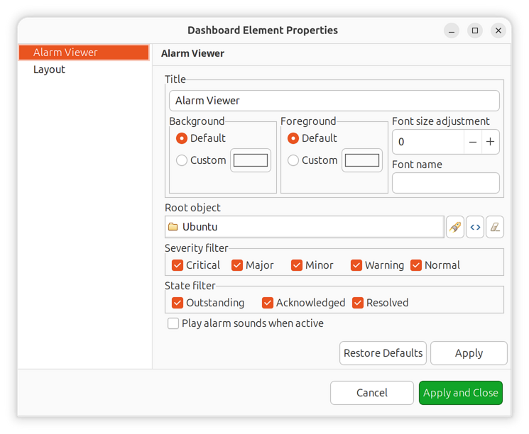
Alarm viewer filter configuration
Syslog Monitor
Real-time syslog message display for a specified object subtree.
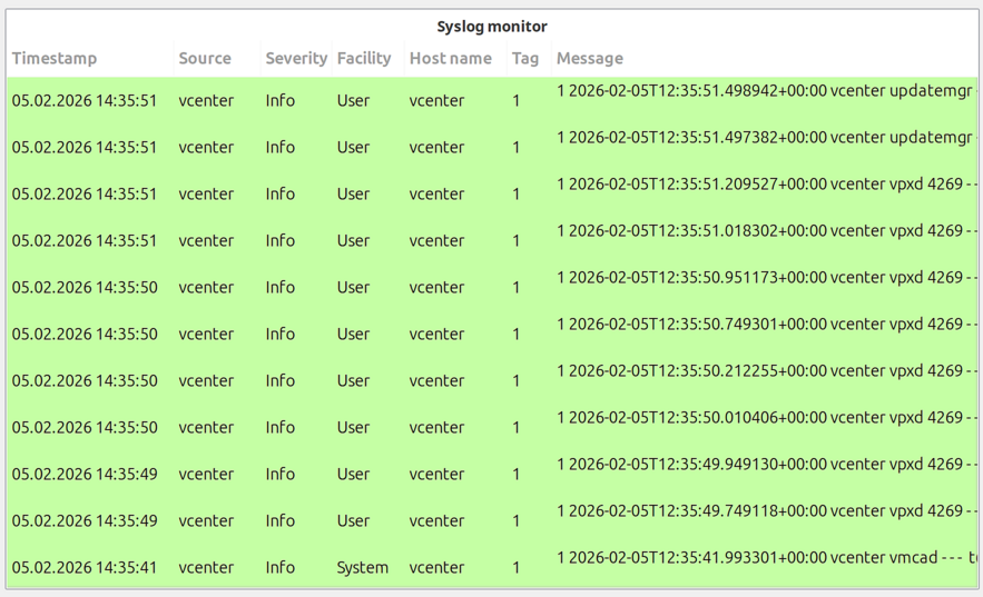
Configure a root object to filter messages to only those from specific objects.
SNMP Trap Monitor
Real-time SNMP trap display for a specified object subtree.
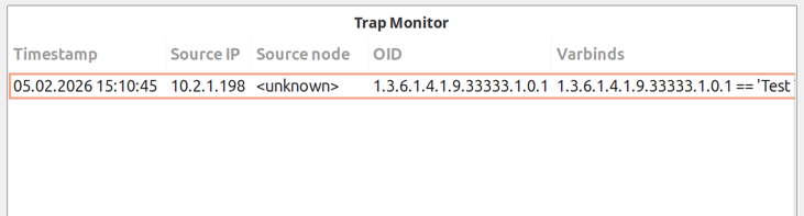
Configure a root object to filter traps to only those from specific objects.
Event Monitor
Real-time event display with filtering options.
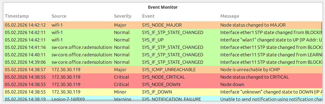
Configuration Options:
Property |
Description |
|---|---|
Root object |
Show events only for this object and its children |
Maximum events |
Limit number of displayed events (default: 100) |
Time range |
Show events from the last N minutes (default: 60) |
Event codes |
Comma-separated list of event codes to display (empty = all events) |
Text filter |
Text string to filter displayed events by message content |
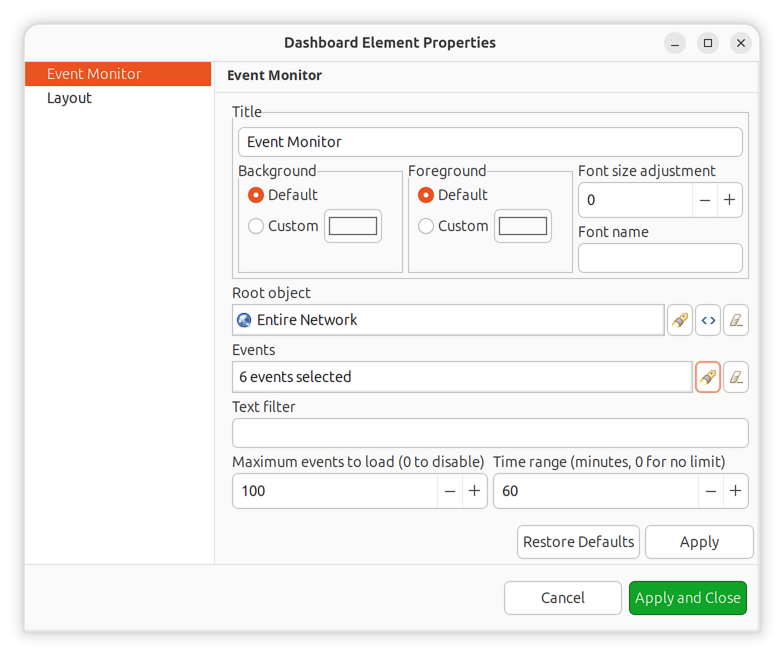
Event monitor filter configuration
File Monitor
Displays the contents of a file from an agent-managed node, similar to tail -f.
Useful for monitoring log files in real-time.
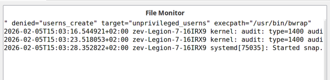
Configuration:
Property |
Description |
|---|---|
Object |
Node with NetXMS agent where the file is located |
File name |
Full path to the file on the monitored node |
History limit |
Maximum number of lines to display (default: 1000) |
Filter |
Regular expression to filter displayed lines |
Syntax highlighter |
Syntax highlighting mode (if applicable) |
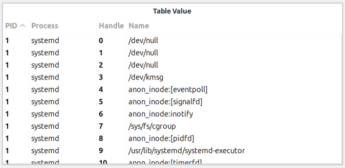
Data Display
Table Value
Displays the last values from a table DCI as a formatted table.
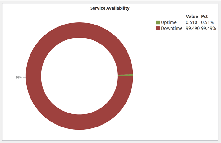
Availability Chart
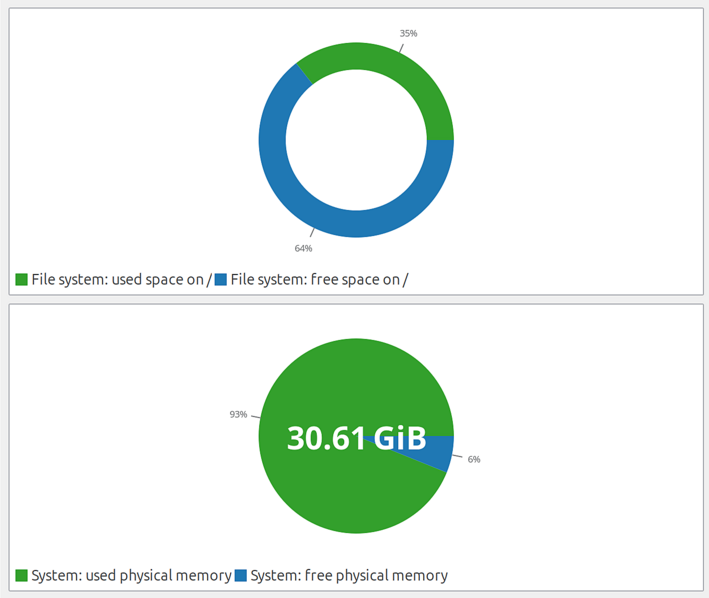
Pie chart showing availability percentage for a business service. Displays uptime vs. downtime ratio.
DCI Summary Table
Displays DCI summary table information for objects under a container.
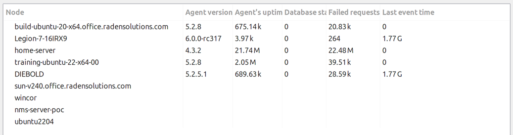
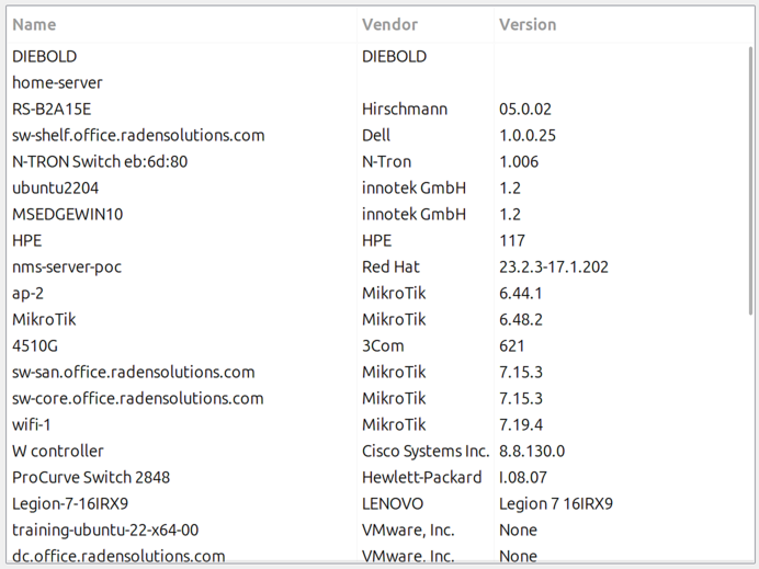
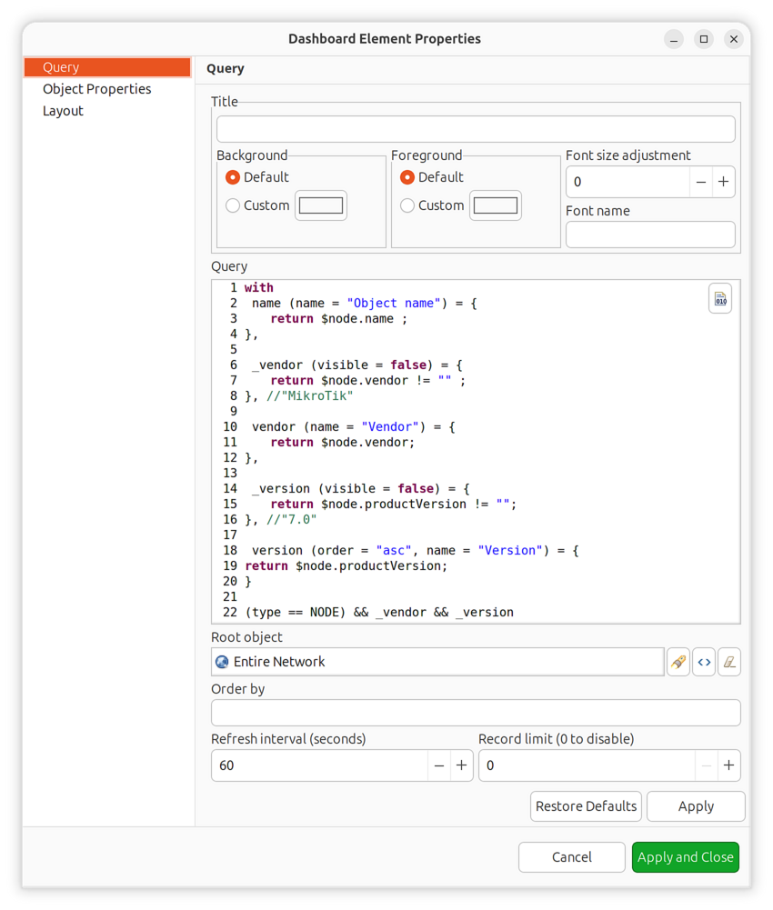
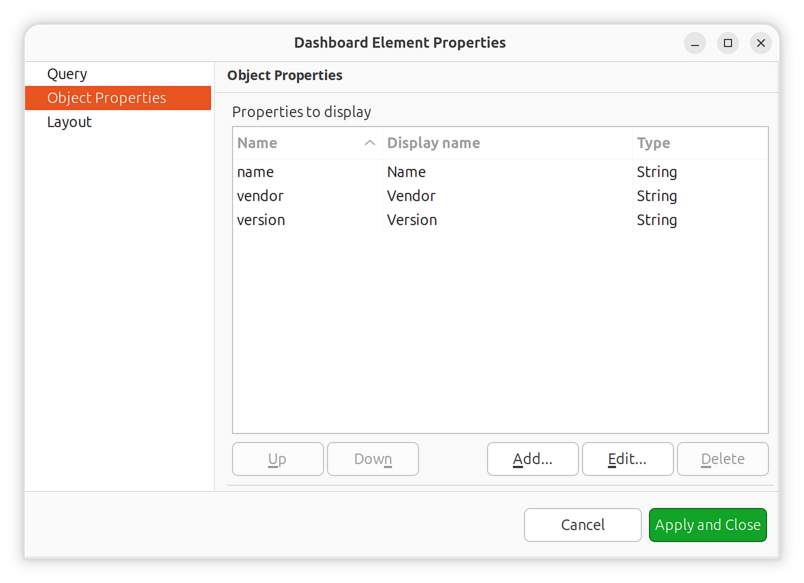
Object Query
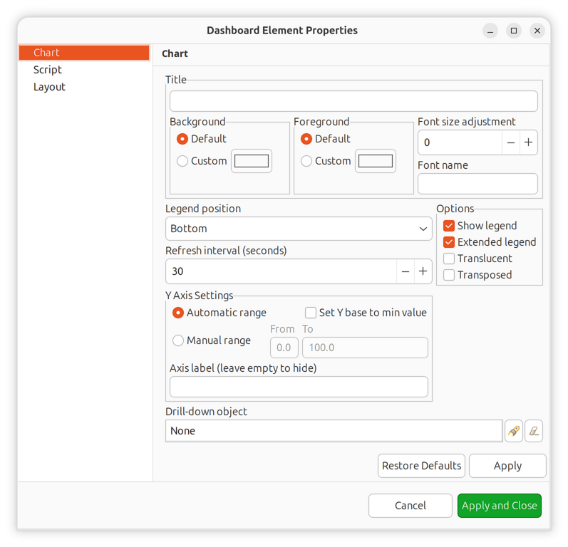
Displays filtered object information in a customizable table format. Uses NXSL queries to select objects and define computed columns.
Object query has two main configuration pages:
Query Configuration:
The query script is executed on each object. If it returns true, the object
is included in the result set. The script can define additional variables that
become columns in the result table.
Three syntax variants are available:
Special “with” syntax for additional columns with metadata:
with
  criticalCount = {
    return GetDCIValue($object, FindDCIByDescription($object, "Critical Alarms"));
  },
  warningCount = {
    return GetDCIValue($object, FindDCIByDescription($object, "Warning Alarms"));
  }
$object->alarmCount > 0 && !$object->isInMaintenanceMode
NXSL script with global variables:
if ($object->alarmCount == 0 || $object->isInMaintenanceMode)
  return false;
global criticalCount = GetDCIValue($object, FindDCIByDescription($object, "Critical Alarms"));
global warningCount = GetDCIValue($object, FindDCIByDescription($object, "Warning Alarms"));
return true;
NXSL script returning a map:
if ($object->alarmCount == 0)
  return false;
return {
  "criticalCount" => GetDCIValue($object, FindDCIByDescription($object, "Critical Alarms")),
  "warningCount" => GetDCIValue($object, FindDCIByDescription($object, "Warning Alarms"))
};
Query Page Options:
Order by: Comma-separated list of columns. Use
+for ascending (default) or-for descending (e.g.,-criticalCount,+name)Refresh interval: How often to re-run the query
Record limit: Maximum number of objects to display
Object Properties Configuration:
Define which columns to display and their order:
Attribute/Variable name: Object attribute or variable name from query
Display name: Column header text
Data type: How to format and sort the column
Query configuration example
Object properties configuration
Embedded Content
Dashboard
Embeds another dashboard object (or multiple dashboards) within the current dashboard. When multiple dashboards are added, they rotate automatically.
Network Map
Renders a network map object as a dashboard element.
Geo Map
Displays a geographic map centered at a specified location or showing object locations.
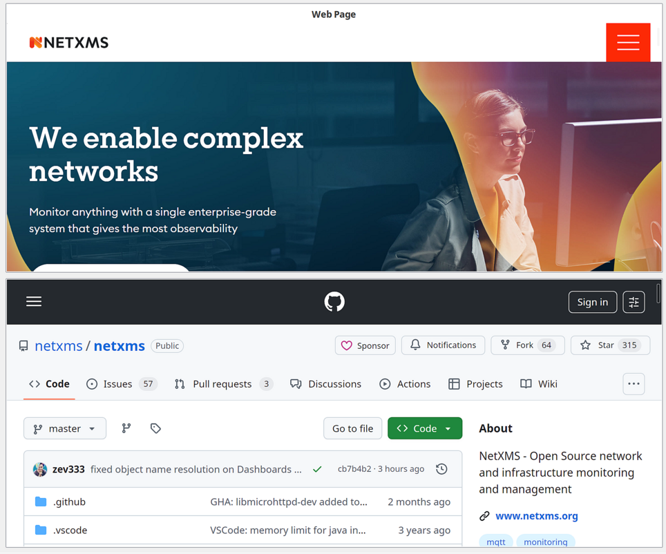
Web Page
Embeds a web page at a specified URL within the dashboard. Useful for integrating external monitoring tools or documentation.
Layout Elements
Separator
Visual separator for organizing dashboard layout. Can be displayed as a line, box, or empty space.
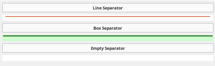
Separator Types:
Line (horizontal or vertical)
Box (rectangular border)
Empty (invisible spacer)
Interactive Elements
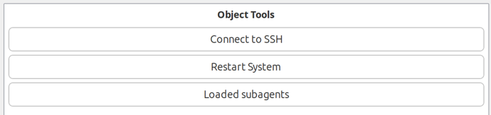
Object Tools
Displays buttons for executing pre-configured object tools.
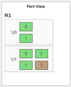
Port View
Shows a schematic representation of network device ports with status indication.
Rack Diagram
Displays a rack visualization showing equipment placement.
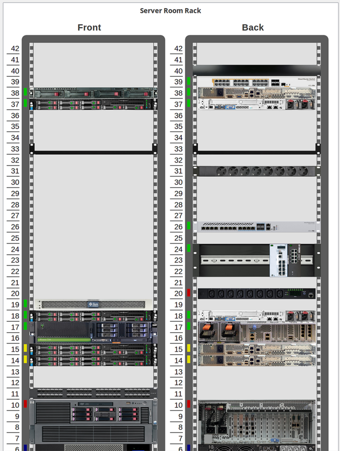
View Options:
Front view only
Back view only
Both views (side by side or combined)
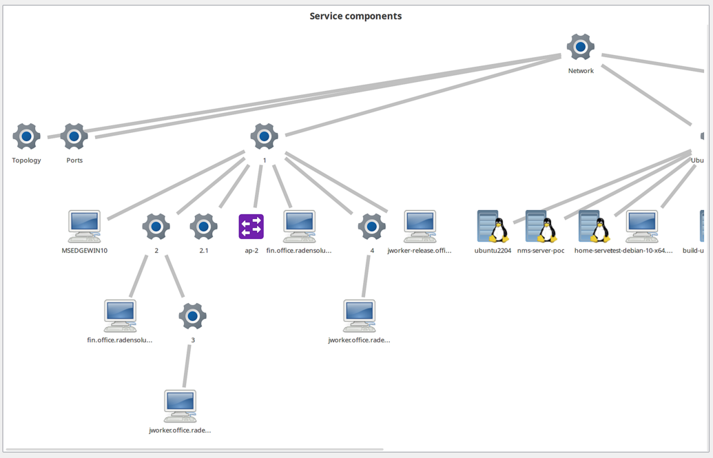
Service Components
Displays the hierarchy of objects in an Infrastructure Service starting from a selected root object.
Element Configuration
All dashboard elements share common configuration options plus element-specific settings.
Title Configuration
Every element can have a customizable title displayed above the element content.
Title configuration options
Property |
Description |
|---|---|
Title |
Text displayed above the element |
Title foreground |
Text color for the title |
Title background |
Background color for the title bar |
Title font name |
Custom font family for the title |
Title font size |
Size adjustment relative to default (positive or negative) |
Chart Configuration
Common settings for all chart elements (Line, Bar, Pie, Gauge, etc.).
Property |
Description |
|---|---|
Show legend |
Display chart legend |
Extended legend |
Show additional statistics in legend (min, max, average) |
Legend position |
Location of legend (Left, Right, Top, Bottom) |
Translucent |
Enable semi-transparent rendering |
Auto scale |
Automatically adjust Y-axis scale to fit data |
Min Y scale |
Fixed minimum Y-axis value (when auto scale is disabled) |
Max Y scale |
Fixed maximum Y-axis value (when auto scale is disabled) |
Y axis label |
Label text for the Y-axis |
Modify Y base |
Use minimum DCI value as Y-axis base instead of zero |
Refresh rate |
How often to refresh chart data (seconds) |
Drill-Down Navigation
Several element types support drill-down navigation, allowing users to click on the element to navigate to another object (typically a dashboard with more detailed information).
Drill-down object selection
Supported element types:
DCI-based charts (Line Chart, Bar Chart, Pie Chart, Gauge, Scripted Bar Chart, Scripted Pie Chart)
Table-based charts (Table Bar Chart, Table Pie Chart, Table Tube Chart)
Status Indicator (per-element drill-down)
Configure drill-down in the element properties:
Property |
Description |
|---|---|
Drill-down object |
Object to navigate to when element is clicked (usually a dashboard) |
When a drill-down object is configured, clicking on the element will open that object’s view. For status indicators, each individual element can have its own drill-down target.
Data Sources
For DCI-based charts, configure data sources to define which DCIs provide the chart data.
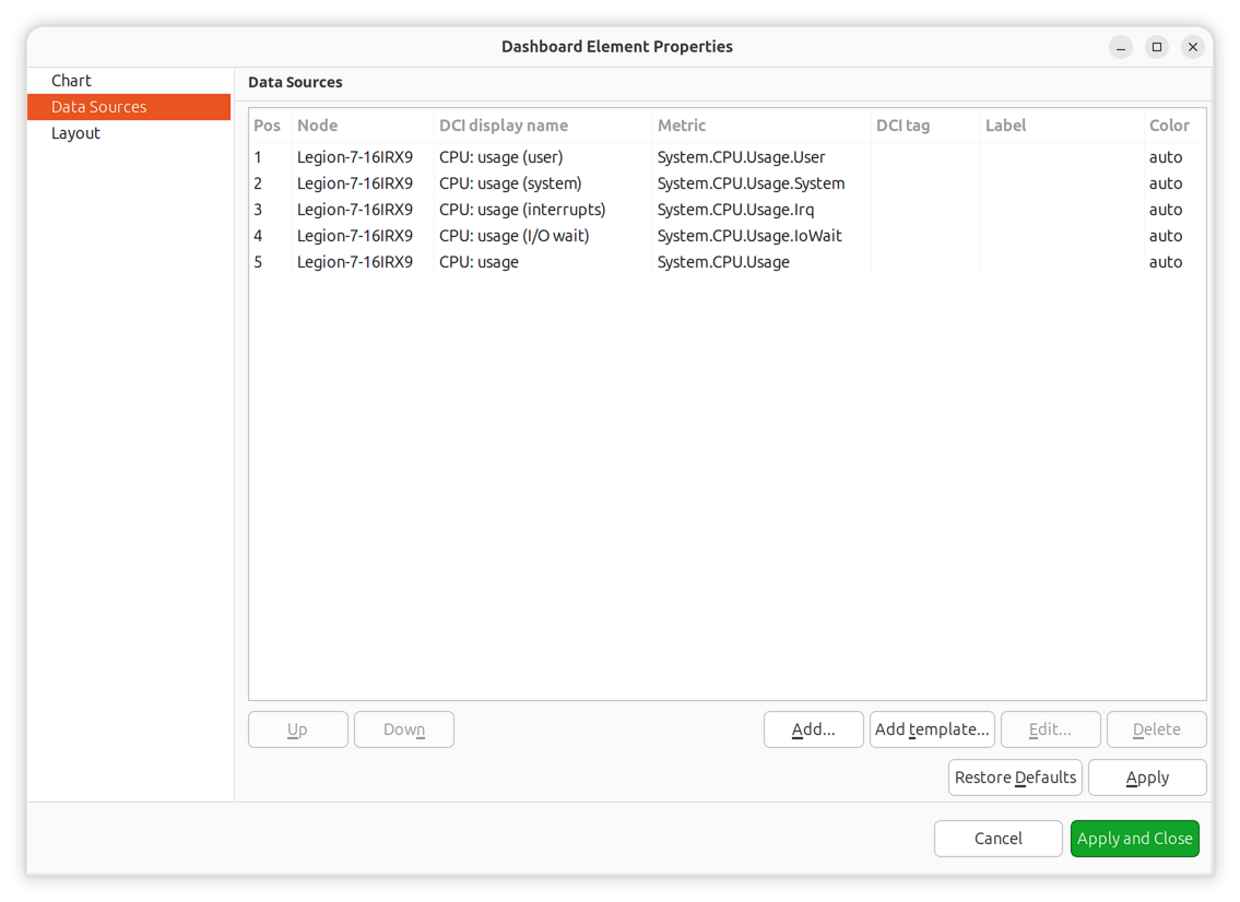
Property |
Description |
|---|---|
Data collection item |
DCI to use as data source |
Display name |
Legend label (uses DCI description if empty) |
Color |
Line/bar color (automatic if not specified) |
Area chart |
Display as filled area instead of line (line charts only) |
Show thresholds |
Display threshold lines on chart (line charts only) |
Up to 16 DCIs can be added to a single chart.
Dashboard Layout
Dashboard uses a grid concept for element positioning. Available space is divided into rows and columns, with each element occupying one or more cells.
Layout Properties
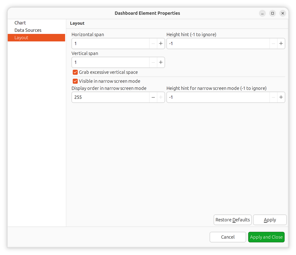
Property |
Description |
|---|---|
Horizontal span |
Number of grid cells this element occupies horizontally |
Vertical span |
Number of grid cells this element occupies vertically |
Horizontal alignment |
How element aligns within its cells (FILL, CENTER, LEFT, RIGHT) |
Vertical alignment |
How element aligns within its cells (FILL, CENTER, TOP, BOTTOM) |
Width hint |
Suggested width in pixels (-1 for automatic) |
Height hint |
Suggested height in pixels (-1 for automatic) |
Grab vertical space |
Whether element should expand to fill available vertical space |
Alignment Values:
Value |
Description |
|---|---|
FILL |
Element fills the entire cell and grabs excess space |
CENTER |
Element centered within cell |
LEFT/TOP |
Element aligned to left/top edge of cell |
RIGHT/BOTTOM |
Element aligned to right/bottom edge of cell |
Grid Layout Example
The number of columns is configured in dashboard properties. Rows are calculated automatically based on elements and their spans.
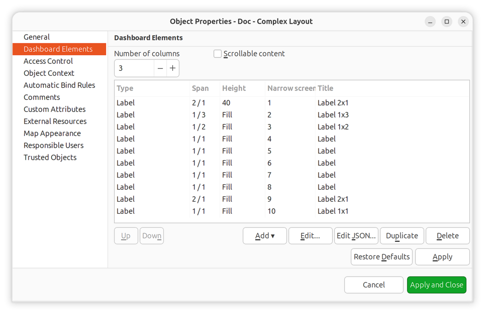
Complex layout configuration
This configuration renders as:
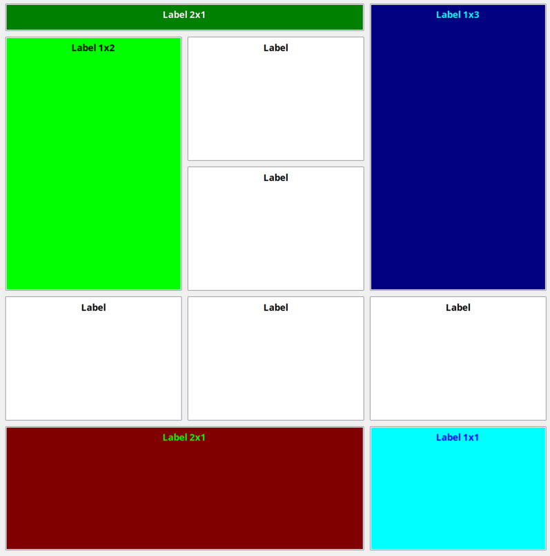
Resulting dashboard layout
Narrow Screen Mode
Dashboards support responsive design for mobile devices and narrow screens. When the display width is below a threshold, the dashboard switches to narrow screen mode.
Layout Properties for Narrow Screen:
Property |
Description |
|---|---|
Show in narrow screen mode |
Whether to display this element on narrow screens |
Narrow screen order |
Sort order for elements in narrow screen mode (0-255) |
Narrow screen height hint |
Height hint specifically for narrow screen display |
In narrow screen mode, elements are displayed in a single column, sorted by their narrow screen order value. Elements with Show in narrow screen mode disabled are hidden entirely.
This allows creating dashboards that work well on both desktop and mobile devices by hiding non-essential elements and reordering remaining elements for vertical display.
Dashboard Rotation
To display multiple dashboards in a loop (useful for monitoring displays):
Create all dashboards you want to show
Create a new dashboard with a single Dashboard element
Add all target dashboards to that element’s list
Set the rotation interval (time each dashboard is displayed)
Configuration for rotating two dashboards every 40 seconds
Delegated Access
Dashboards can display data from objects that users don’t have direct read access to, using the Delegated read access right. This enables creating monitoring dashboards for users who should see specific visualizations without having full access to the underlying infrastructure.
Delegated read only allows viewing object data through the dashboard. Users cannot browse these objects directly or access data outside the dashboard context.
Delegated read can be set on specific objects, on containers or on root objects, e.g. on Infrastructure Services.
Added in version 5.0.
Reference
Element Types
Complete list of all dashboard element types:
Type |
Description |
|---|---|
Label |
Text label with configurable formatting |
Line Chart |
Time-series line graph |
Bar Chart |
Vertical or horizontal bar chart |
Pie Chart |
Proportional pie chart |
Tube Chart |
Tube visualization (deprecated) |
Status Chart |
Object status distribution chart |
Status Indicator |
Object/DCI status display |
Dashboard |
Embedded dashboard(s) |
Network Map |
Embedded network map |
Geo Map |
Geographic map view |
Alarm Viewer |
Active alarm list |
Availability Chart |
Service availability pie chart |
Gauge |
Single-value gauge (dial, bar, text, circular) |
Web Page |
Embedded web page |
Table Bar Chart |
Bar chart from table DCI |
Table Pie Chart |
Pie chart from table DCI |
Table Tube Chart |
Tube chart from table DCI (deprecated) |
Separator |
Visual separator element |
Table Value |
Table DCI data display |
Status Map |
Hierarchical status visualization |
DCI Summary Table |
Summary table for container DCIs |
Syslog Monitor |
Real-time syslog display |
SNMP Trap Monitor |
Real-time trap display |
Event Monitor |
Real-time event display |
Service Components |
Infrastructure service hierarchy |
Rack Diagram |
Rack equipment visualization |
Object Tools |
Tool execution buttons |
Object Query |
Custom object query table |
Port View |
Network port status schematic |
Scripted Bar Chart |
Script-generated bar chart |
Scripted Pie Chart |
Script-generated pie chart |
File Monitor |
Remote file content display |
Gauge Types
Type |
Description |
|---|---|
Dial |
Radial gauge with needle indicator (speedometer style) |
Bar |
Linear bar gauge, horizontal or vertical |
Text |
Numeric text display with optional color coding |
Circular |
Modern circular arc gauge with gradient fill |
Status Indicator Shapes
Shape |
Description |
|---|---|
Circle |
Circular indicator (default) |
Rectangle |
Square/rectangular indicator |
Rounded Rectangle |
Rectangle with rounded corners |
Status Indicator Element Types
Type |
Description |
|---|---|
Object |
Status from object status |
DCI |
Status from specific DCI threshold |
DCI Template |
Status from DCIs matching pattern |
Script |
Status from NXSL script execution |
Graphs
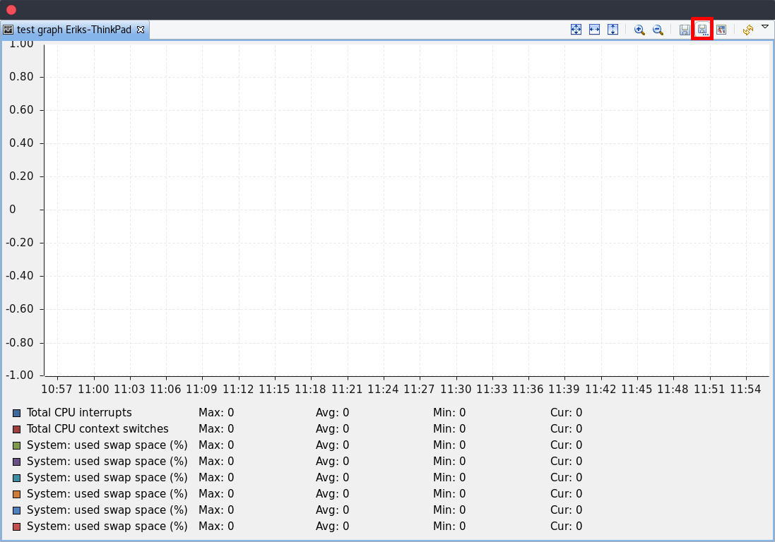
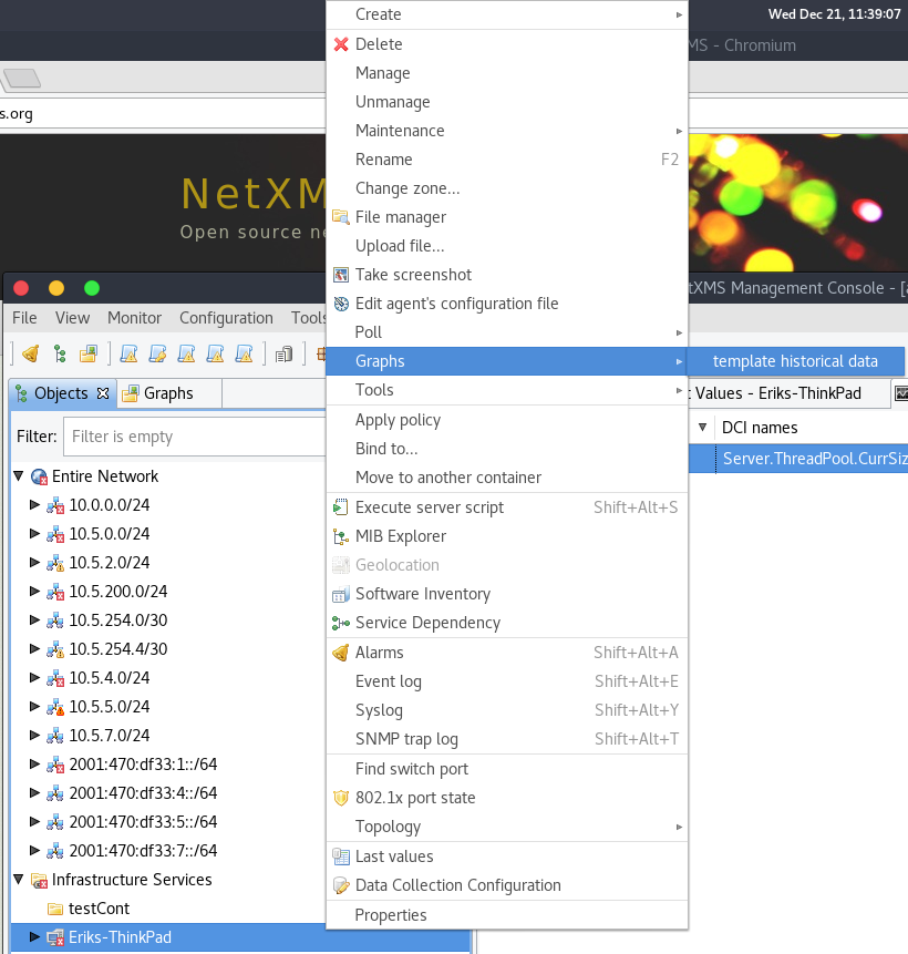
You can view collected data in a graphical form, as a line chart. To view values of some DCI as a chart, first open either Data Collection Editor or Last Values view for a host. You can do it from the Object Browser or map by selection host, right-clicking on it, and selecting Data collection or Last DCI values. Then, select one or more DCIs (you can put up to 16 DCIs on one graph), right-click on them and choose Graph from the pop-up menu. You will see graphical representation of DCI values for the last hour.
When the graph is open, you can do various tasks:
Select different time interval
By default, you will see data for the last hour. You can select different time interval in two ways:
Select new time interval from presets, by right-clicking on the graph, and then selecting Presets and appropriate time interval from the pop-up menu.
Set time interval in graph properties dialog. To access graph properties, right-click on the graph, and then select Properties from the pop-up menu. Alternatively, you can use main application menu: . In the properties dialog, you will have two options: select exact time interval (like
12/10/2005 from 10:00
to 14:00
) or select time interval based on current time (likelast two hours).
Turn on automatic refresh
You can turn on automatic graph refresh at a given interval in graph properties dialog. To access graph properties, right-click on it, and select Properties from the pop-up menu. Alternatively, you can use main application menu: . In the properties dialog, select the Refresh automatically checkbox and enter a desired refresh interval in seconds in edit box below. When automatic refresh is on, you will see Autoupdate message in the status bar of graph window.
Change colors
You can change colors used to paint lines and graph elements in the graph properties dialog. To access graph properties, right-click on it, and select Properties from the pop-up menu. Alternatively, you can use main application menu: . In the properties dialog, click on colored box for appropriate element to choose different color.
Save current settings as predefined graph
You can save current graph settings as predefined graph to allow quick and easy access in the future to information presented on graph. Preconfigured graphs can be used either by you or by other NetXMS users, depending on settings. To save current graph configuration as predefined graph, select Save as predefined from graph view menu. The following dialog will appear:
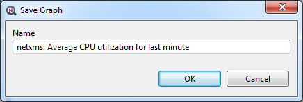
In Graph name field, enter desired name for your predefined graph.
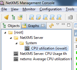
It will appear in predefined graph tree exactly as written here. You can use
-> character pair to create subtree. For example, if you name your graph
NetXMS Server->System->CPU utilization (iowait) it will appear in the tree
as following:
You can edit predefined graph by right-clicking on it in predefined graph tree, and selecting Properties from context menu. On Predefined Graph property page you can add users and groups who will have access to this graph. Note that user creating the graph will always have full access to it, even if he is not in access list.
If you need to delete predefined graph, you can do it by right-clicking on it in predefined graph tree, and selecting Delete from context menu.
Save current settings as template graph
Current graph settings can be saved as a template graph for an easy template graph creation. The difference between predefined graphs and template graphs are that template graphs are not configured to view specific DCI`s on a node, instead they are configured to view DCI names that can be found on many nodes (e.g. FileSystem.FreePerc(/)). This allows for the creation of certain graph templates to monitor, for example, disk usage that can be reused on any node to which the appropreate DCI`s are applied on via DCI configuration.
See detailed information on template graphs in the section Template Graph Configuration.
In the Graph name field of the pop-up save dialog, enter the desired name for the template graph by which you can later identify your it in the Template Graph Configuration which can be found in .
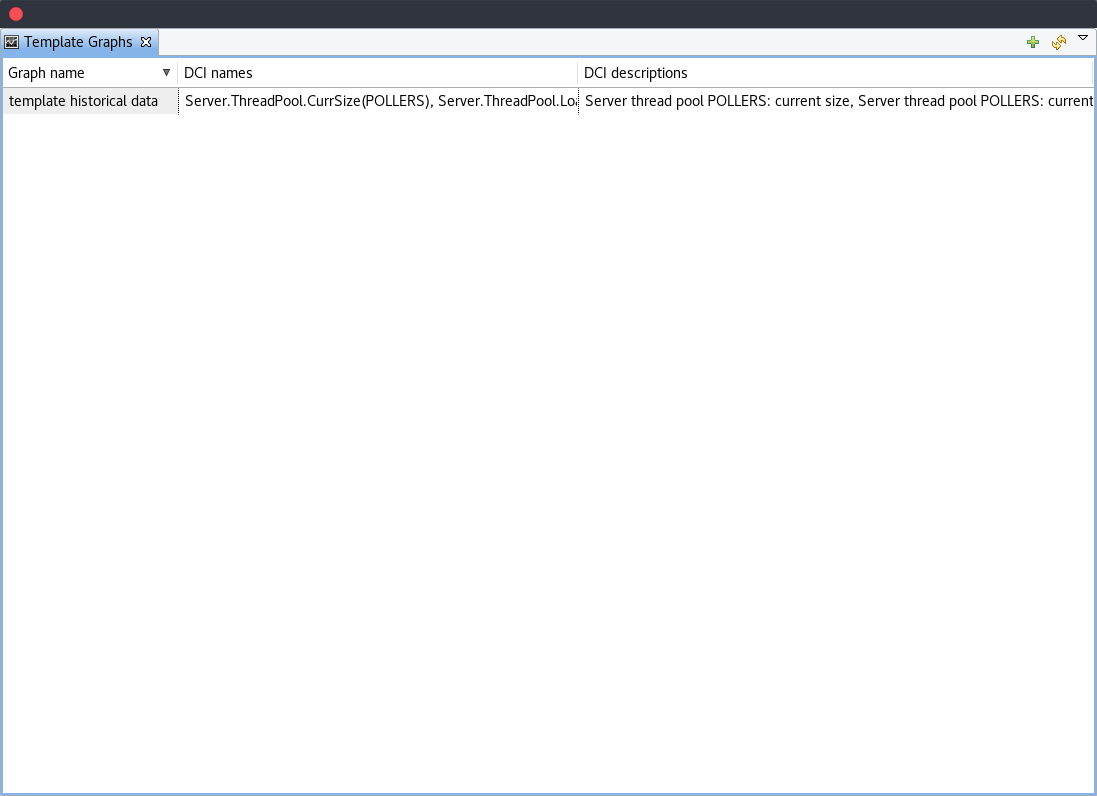
Template graphs can be accessed in the Object Browser as seen on the screenshot above. When a template graph is created, it will appear in the sub-menus of the nodes found in Object Browser, the rest of the settings can be accessed by editing a template graph in the Template Graph Configuration.
Template Graph Configuration
Template graphs are used to ease the monitoring of a pre-set list of DCI`s on multiple nodes by adding a list of DCI names to the template source. This allows for the possibility to create templates to monitor specific data on any node to which the appropriate DCI`s are applied on.
The Template Graph Configuration is used to create and edit template graphs. Properties for already created template graphs can be brought up by double clicking the template graph you wish to edit and new ones can be added by pressing the green cross on the top right or by right clicking and selecting Create new template graph.
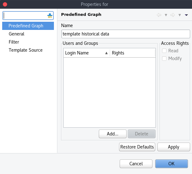
Name and access rights of a graph
The above property page provides the possibility to configure the name of the template graph and the access rights. The user who has created the template graph will have full access to it even though the username will not show up in the access right list.
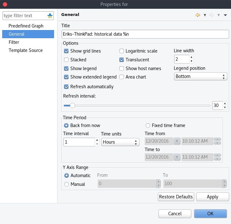
General graph properties.
Title:
The title that the graph will have when opened.
The title can contain special characters described in Macro Substitution.
Options:
Option |
Description |
|---|---|
Show grid lines |
Enable or disable grid lines for the graph. |
Stacked |
Stacks the graphs of each value on top of one another to be able to see the total value easier (e.g. useful when monitoring cpu usage). |
Show legend |
Enable or disable the legend of the graph. |
Show extended legend |
Enable or disable the extended legend of the graph (Max, Avg, Min, Curr). |
Refresh automatically |
Enable or disable auto-refresh. |
Logarithmic scale |
Use the logarithmic scale for the graph. |
Translucent |
Enable or disable the translucency of the graph. |
Show host names |
Show host name of the node from which the value is taken. |
Area chart |
Highlights the area underneath the graph. |
Line width |
Adjust the width of the lines. |
Legend position |
Set the position of the legend. |
Refresh interval |
Set the refresh interval. |
Time Period:
Provides the possibility to configure the time period of the graph. It is possible to set a dynamic time frame (Back from now) and a static time frame (Fixed time frame).
Y Axis Range:
Adjust the range of the Y axis on the graph.
Template graph filter properties.
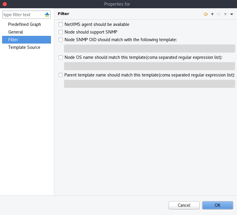
It may be necessary to set certain filters for a template graph. This can be useful if the graph contains DCI names that are only available on NetXMS agent or are SNMP dependant.
More information on filters can be found in Filter.
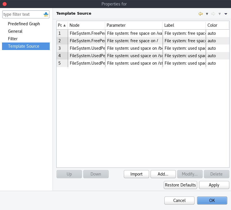
Template graph sources
There are two options to add sources to the template graph. Sources can be added manually by configuring the Data Source parameters yourself or by importing data source information from DCI`s that have already been applied to other nodes.
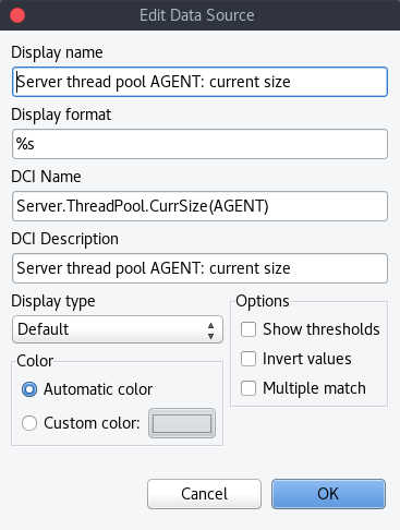
When adding or editing a source, it is possible to use Java regex in the DCI Name and DCI Description fields. This can be handy when used with the Multiple match option which will use all DCI`s that match the particular regex. The order in which the DCI list is searched is first by DCI Name and then by DCI Description.
History
You can view collected data in a textual form, as a table with two columns - timestamp and value. To view values of some DCI as a table, first open either Data Collection Editor or Last Values view for a host. You can do it from the Object Browser or map by selection host, right-clicking on it, and selecting Data collection or Last DCI values. Then, select one or more DCIs (each DCI data will be shown in separate view), right-click on them and choose Show history from the pop-up menu. You will see the last 1000 values of the DCI.
Summary table
It is possible to see DCI data as a table where each line is one node and each column is a DCI. It can be configured for each summary table which DCIs should be present on it.
Configuration
DCI summary table can be configured in Configuration -> Summary Table.
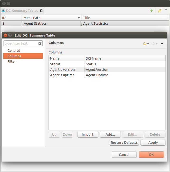
General:
Menu path - path where this summary table can be found. You can use
->character pair to create subtree like “Linux->System information”.Title - title of the summary table.
Columns:
This is the list if DCI’s that will be shown on the summary table. Name is the name of column and DCI Name is DCI parameter name.
Multivalued column is intended to present string DCIs that contain several values divided by specified separator. Each value is presented on a separate line in the column.
If Use regular expression for parameter name matching is enabled, a regular expression is specified in DCI name field. If several DCIs will be matched on a node, only one will be displayed.
Import button allows to select a DCI from existing object.
- Filter:
Filter script is executed for each node to determine, if that node should be included in a summary table. Filter script is defined with help of NXSL scripting language.
Usage
After DCI summary table is configured it can be accessed in container object (Subnet, container…) context menu under “Summary tables”.